0 members and 822 guests
No Members online

» Site Navigation

» Stats
Members: 35,442
Threads: 103,075
Posts: 826,688
Top Poster: cc.RadillacVIII (7,429)
|
-
 Alien vs Predator Alien vs Predator
Well, this sig was made thanks to your cool tuts.

Link : http://img215.imageshack.us/img215/1676/avp2copyew9.jpg
( if you dont see the sig )
I realy like your tuts. You guys r great! Keep it up Keep it up
I hate the hosting sites. >_>
Last edited by Testament; 09-24-2007 at 01:56 AM.
-

Way to tall
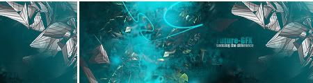
I cant really see the renders they are to invisible. make them stand out some more right now the focal point is your text
-
work on txt...
And the dimensions are way tooo big...
 Live today to fight tomorrow Live today to fight tomorrow
NEWEST
-
Yea, the render is really hard to make out. Go a little easiar on the text. And devon, no offense, but you're not exactly one to talk about dimensions being too big, haha
[Latest]


**Do unto others, as thou shalt not steal**
-
HEhe just since you pointed out devons comment i will go on yours.
no offence but you're not exactly one to talk abaout going easy on text. 
-
I know this tends to be 'spam' on most forums, but I cant help it...
ROFL at all that^. I'm almost scared to comment, now:P Lets see...what can I say about this sig that i dont do whatsoever...ahhh, yes. Waaay too many patterns(scanlines, grids, etc). They totally take away from this. Also, the grainy brushing(?) over the right side doesnt help. And I agree with the other points mentioned.
Similar Threads
-
By AcidGlow in forum Sigs & Manips
Replies: 21
Last Post: 10-19-2005, 03:49 PM
-
By PREDATOR. in forum Introductions
Replies: 6
Last Post: 10-01-2005, 04:56 PM
-
By Lokiwho in forum Sigs & Manips
Replies: 2
Last Post: 09-04-2005, 09:42 AM
-
By keewee in forum Digital Art
Replies: 1
Last Post: 06-19-2005, 04:02 PM
 Posting Permissions
- You may not post new threads
- You may not post replies
- You may not post attachments
- You may not edit your posts
-
Forum Rules
|


 Reply With Quote