0 members and 1,751 guests
No Members online

» Site Navigation

» Stats
Members: 35,442
Threads: 103,075
Posts: 826,688
Top Poster: cc.RadillacVIII (7,429)
|
-
 Children of Bodom sig. Experimented a bit. Children of Bodom sig. Experimented a bit.
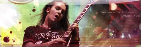
Well, what do you thing? Any suggestions on what I could improve on?
Last edited by LPKoRnA7X; 09-28-2007 at 06:38 PM.
NEW ACCOUNT NAME=REINKAOS
-
How did you make the border? I can never seem to find a tutorial on how to make borders like that!
-
One thing you could do to improve this sig is to get rid of the scanlines.
Keep a 1 px simple border or go with a cenima border.
Maybe aff some clipping mask to make the bg more interesting.
Make the render blend in some more, either with some effects or the eraser tool  keep at it. keep at it.
-

Only thing is that, well, I'm not quite sure what the clipping mask is. o.O
NEW ACCOUNT NAME=REINKAOS
-
ohh, you make a new Layer and then with a brush, splatter works good here, brush some on that layer. (any color can be used) Then hide the newly brushed layer, create a new one again. Go image>apply image. Now you go Ctrl+alt+g that will create a clipping mask. Move that layer around and you will see what it does.
-
Oh Thanks. Lol. I know what that is, just wasn't familiar with the name lol.
NEW ACCOUNT NAME=REINKAOS
-
The light source you added should be for userbars, not for sigs, try a 300 px soft brush on white, then a new layer 150 px soft brush on yellow, and set it to screen.
The lines on the botton look kind of like they don't belong there.
Try in really small text, like 3-4 to put the lyrics of a few of their songs in the bg, like just to add depth to it
Other wise, add a few more clipping masks, and give the dl to those arrow shapes, I like the look of them
over all: 8/10

"Judge a man by his questions,
not his answers."
-Voltaire
-
 Originally Posted by tunafish69

The light source you added should be for userbars, not for sigs, try a 300 px soft brush on white, then a new layer 150 px soft brush on yellow, and set it to screen.
The lines on the botton look kind of like they don't belong there.
Try in really small text, like 3-4 to put the lyrics of a few of their songs in the bg, like just to add depth to it
Other wise, add a few more clipping masks, and give the dl to those arrow shapes, I like the look of them
over all: 8/10
Well there is something here, Tuna does you really use a 300 pc brush to make light sources? thats like OMFG big. I have like 100-200px and then at least half of the brush out of the sig then i go down to 70-90 px and make the light source. Mostly like 86.
-
I dont think the style fits with Children of Bodom at all, but except from that, it's a good sig.
Similar Threads
-
By Shadowz in forum Sigs & Manips
Replies: 5
Last Post: 07-03-2007, 08:34 AM
-
By s0ggywaffls in forum Sigs & Manips
Replies: 6
Last Post: 04-13-2007, 05:18 PM
-
By SgtSwabs in forum The Void
Replies: 19
Last Post: 09-11-2006, 04:09 PM
-
By Elder-Bunny in forum Sigs & Manips
Replies: 8
Last Post: 08-04-2006, 04:14 PM
-
By PenguinElitist in forum The Void
Replies: 8
Last Post: 11-23-2005, 04:16 PM
 Posting Permissions
- You may not post new threads
- You may not post replies
- You may not post attachments
- You may not edit your posts
-
Forum Rules
|


 Reply With Quote


