0 members and 16,520 guests
No Members online

» Site Navigation
» Stats
Members: 35,442
Threads: 103,075
Posts: 826,688
Top Poster: cc.RadillacVIII (7,429)
|
-
Tonami
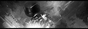
Well i liked NSR's muddy cracks sig, but i didnt want to do his tut. (not that it isnt good cuz it is.) no more because i wanted to create some on my own but i took like him big on the sharpen, as you see the bg or effects arent really alike but the sharpness is. Here is what i came up with:
V1:

V2:

V3:

If you want a tut for this then write after your comment.
Last edited by Daemon; 10-07-2007 at 03:58 PM.
-
it's cool, i'd go with v1 or v2. don't like the text though. i think it'd look good horizontal and to the right of the dude. i can show you what i mean if you don't mind.
the c4d's look a little too much like c4d's (if you know what i mean) in that they're just kinda thrown in there. the colors they add are cool though, definitely wouldn't get rid of them altogether. if you could get them to fit in a little better it'd be great. that's more minor though, the text is my only major complaint. overall solid.
edit - the lighting at the bottom is a little off, should be a bit more to the right. now that i noticed it, it really bothers me :/
Last edited by Jeff; 10-07-2007 at 12:42 PM.
-
I like the 1st one.
Nice effect on render 
I don't like the collors ;/
NEWEST
MY FIRST
-
v2 ftw. I love the colors ther. The text isn't that bad imo... Twist a couple of degrees x) Doesnt align with some of the lines, and it bothers me x)
But overall really good sig
TUT ME
Last edited by cC.Aleksander; 10-08-2007 at 03:05 PM.
-
I like it. Really i like it... (in love)
but...
For you deamon...
this sig can be better...
maybe.. more, maybe I will say "energy" needed in this sig...
I know that you can do better...
But dont take this personaly that i mean that this sig is bad.. no.. this sig is great...
but for me maybe need some energy or some action...
its LITTLE(very) kinda boring for me...
anyway I like your sig and I said some bad words about your sig but but I am so qyarrelsome you know...
and I am repeating your sig is nice and I like to look at it...
until sig like that for me is long way so i CANT say about it very bad words, but you know...
-
Hehe thx all hmm i see what you mean jeff. and about the text i dont mind i can send you the psd later
Garis i know what you mean but i cant be perfect all the time 
hehe the sig was made on properly 15 minutes just waiting for my girl to arive
-
-
Nice, it really does look like the muddy crack sig.
-
ahhh, copyin my style lol
Anyways, I think the c4d could use some blending...
Otherwise, the lkighting and flow are pretty nice
-
Awesome, love the colors, love the sprite thingy, love the bg, love the sig. Tut Tut Tut!
Last edited by Reinkaos; 10-08-2007 at 02:58 PM.
Posting Permissions
- You may not post new threads
- You may not post replies
- You may not post attachments
- You may not edit your posts
-
Forum Rules
|