


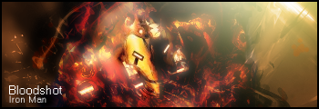
Alright, so I made an Iron Man sig a while ago, and I found it was a great improvement for me, umm, but I'm really horrible at text, and I was wondering if you guys could give me some advice on how I could fix the text up to make it look good? also, if you think anything else should be fixed it would be greatly appreciated, thanks =D
alright well heres the sig...
http://s190.photobucket.com/albums/z...ision2copy.png


 Reply With Quote