0 members and 690 guests
No Members online

» Site Navigation

» Stats
Members: 35,442
Threads: 103,075
Posts: 826,688
Top Poster: cc.RadillacVIII (7,429)
|
-
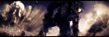
 Halo 3 Halo 3
I am sorta newby at sig making but I really like this one, especially the left side.

-
its actually really good i like it... it could work on the blending, overall 8.5/10 great job!
:Latest:

:Favorite:

-
great blending but not feeling the colors
-
The BG of the sig is really smooth looking, and Master Cheif looks very choppy and rough. The rough master chief thing isn't your fault it is just the render ( i know I've seen it a lot) but it hurts the blending and flow of the sig. Maybe try adding some hard smudging or something to make the render blend more? Overall not too bad, keep it up, just try and work on flow.
 My DevART
RATCHET is my bitch
Andrew says:
u ever stolen a bible?
Apathy says:
no
used the last two pages to roll a joint though
Andrew says:
wow
thats fucking hard core
^^HAHAHA, dm sucks XD
-
Sharpen it. I think for Master Chief it would look better with a "crusty" look.
-
Yearh id say you need to work a bit on the flow the angle of the bg isnt following the chief thats my biggest problem.
-
I love it dude keep up the great work the color and and the flow and the blending is great good job
-
looks great man. the colors look good working with MC. the light coming in on top and him looking up is really cool
Similar Threads
-
By Trikato in forum Sigs & Manips
Replies: 11
Last Post: 08-19-2007, 06:18 PM
-
By Papa in forum Sigs & Manips
Replies: 4
Last Post: 08-03-2007, 09:00 AM
-
By Papa in forum Sigs & Manips
Replies: 5
Last Post: 07-21-2007, 06:36 PM
-
By G-man in forum Digital Art
Replies: 2
Last Post: 07-19-2007, 09:23 AM
-
By Etitan in forum Digital Art
Replies: 9
Last Post: 06-16-2006, 05:34 PM
 Posting Permissions
- You may not post new threads
- You may not post replies
- You may not post attachments
- You may not edit your posts
-
Forum Rules
|


 Reply With Quote