0 members and 932 guests
No Members online

» Site Navigation

» Stats
Members: 35,442
Threads: 103,075
Posts: 826,688
Top Poster: cc.RadillacVIII (7,429)
|
-
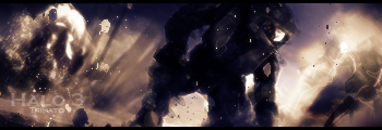
 Got bored, Made this. Got bored, Made this.

Comments?
-
The sig itself needs to be a tad bigger I don't really like the colors of it but then again I just don't like purple xD um the strands of the c4d exploding outwards needs work or atleast you need to add more to those sides if you make it bigger I think I'll be able to see the render more
-
its smaller then normal but looks good. If the render was easyer to see, stood out more, blends to much into the bg.
The text seems kinda shoved in there and hard to read
-
i agree with everything these guys said :P
it looks to me like all there is, is a C4D and a render with text, maybe add some kind of border, do some blending, etc...
-
bad sizing, c4d too messy render doesnt work text too big needs a border more interesting BG lighting, just about everything, blending was okay i guess
i didnt really like it overall, sorry man, try some of the tuts around here
:Latest:

:Favorite:

Similar Threads
-
By Fur in forum Sigs & Manips
Replies: 3
Last Post: 05-05-2007, 08:26 AM
-
By Virulent in forum Digital Art
Replies: 3
Last Post: 04-29-2006, 11:48 PM
-
By t-k in forum Sigs & Manips
Replies: 1
Last Post: 09-28-2005, 07:44 PM
-
By katgirl21 in forum Digital Art
Replies: 2
Last Post: 06-19-2005, 10:32 PM
-
By HeadShot in forum Digital Art
Replies: 5
Last Post: 02-21-2005, 03:11 AM
 Posting Permissions
- You may not post new threads
- You may not post replies
- You may not post attachments
- You may not edit your posts
-
Forum Rules
|


 Reply With Quote