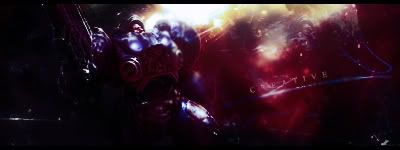
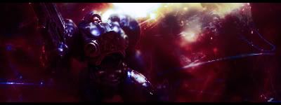
GFXVoid Graphic Design Forum

Remove Text Formatting
Loading...

» Online Users: 6,427

0 members and 6,427 guests
No Members online

» Site Navigation

 > FAQ

» Stats

Members: 35,442
Threads: 103,075
Posts: 826,688
Top Poster: cc.RadillacVIII (7,429)
Welcome to our newest member, Lekelindids
Results 1 to 3 of 3

Thread: New sig :)

  1. #1
    Join Date
    Aug 2007
    Location
    Denmark :O
    Posts
    38

    Cool New sig :)

    v1:


    v2:

    Last edited by Creative; 11-29-2007 at 05:03 AM.
    NEWEST


    MY FIRST


  2. #2
    Join Date
    Feb 2005
    Posts
    1,492

    Default

    Starcraft <3.

    V1 is better, but they're both a little dark. The light source would add to more than just his face.

  3. #3
    Join Date
    Mar 2007
    Location
    Denmark
    Posts
    4,197

    Default

    Well the sig is general to dark, there isnt enought light. you can see light only shines upon his face but still there is light on his legs and chest? that needs fixments. also the blending isnt that good. try blend it some more. text?


Posting Permissions

  • You may not post new threads
  • You may not post replies
  • You may not post attachments
  • You may not edit your posts
  •  
Powered by vBadvanced CMPS v4.1.1