0 members and 4,364 guests
No Members online

» Site Navigation

» Stats

Members: 35,442
Threads: 103,075
Posts: 826,688
Top Poster: cc.RadillacVIII (7,429)
|
-
 Xai Xo's Signaturios. Xai Xo's Signaturios.
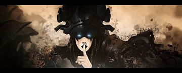
'Ello there Void, been on here for a short while as a member, so I figured I should finally post up a few of my signatures.
Yes, I am aware that most of them don't have my name-I created them for members of my Xbox LIVE clan, WelshHardMen [WHM]. I have a thread on our website where we all showcase banners, signatures and the like, and people have requested signatures off me. Aaaanyway, here we go, in no particular order....


   Religion gives nothing in life, only in death.
-

dude the sigs arn't really like skilled but the way you put each one together just works! that's a sign that you know what you're doing atleast a few arn't like the cars and some obscure colour variations with the renders you chose.. but they work nice job
deaz\dxloa\dxedr

-

Thanks.
When I'm asked to do signatures, I ask the colours wanted, any focus image, and text. If the colour they want doesn't go with the render/image (such as Scooby Blue's Subaru), I have no say in the matter, you see. :\
   Religion gives nothing in life, only in death.
-

Sorry but im not a fan... They are too long for me, Some parts are messy, and unclear, just a little work but the scooby Blue is horrific sadly :S
The text is pretty big and takes off the main focal points... but then again everyone needs practice 

          
 [((_CRAYOLA_((]>[((_CRAYOLA_((]>[((_CRAYOLA_((]>[((_CRAYOLA_((]>[((_CRAYOLA_((]>[((_CRAYOLA_((]>
-

The legnth of the signatures (I'm assuming you mean width) is simply because they are meant to identify between members easily-Our forum has alot of stupidly long threads, so finding people easily while reading is the main purpose.
As for the size of the text, I've never been a fan of this whole "trendy" tiny text that you have to squint to read properly.
   Religion gives nothing in life, only in death.
-

You dont need to have tiny tiny text but yours is humongous big, sorry to say but it takes away all the attention from the sig, as since its so big it becomes a focal point. I dont like the lenght on the sig. you also need to work with placement and blending. Also watchout that you dont have 2-3 focal points.
 Posting Permissions
- You may not post new threads
- You may not post replies
- You may not post attachments
- You may not edit your posts
-
Forum Rules
|


 Reply With Quote


