GFXVoid Graphic Design Forum

Remove Text Formatting
Loading...

» Online Users: 4,269

0 members and 4,269 guests
No Members online

» Site Navigation

 > FAQ

» Stats

Members: 35,442
Threads: 103,075
Posts: 826,688
Top Poster: cc.RadillacVIII (7,429)
Welcome to our newest member, Lekelindids
Results 1 to 3 of 3

Thread: Two

  1. #1
    Join Date
    Mar 2007
    Location
    Oslo, Norway
    Posts
    1,509

    Default Two

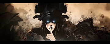
    I've made two sigs I'd really appreciate some comments on^^

    First one i made from a C4D render by Jorrne(creds to him for that), and i know it needs some blending, but meh... i'm happy with it^^


    Second one is a entry for the battle with me, daemon and creative.. Reqired render.

    Formerly known as silentshadow
    http://flickr.com/aeilertsen

  2. #2
    Join Date
    Mar 2007
    Location
    Denmark
    Posts
    4,197

    Default

    the first kewl bg, but as you mentioned yourself really scream out for some blening good text there though tell me on msn what that font is looks amazing

    The other one gmv in the battle. I would like you to moove the render a bit more to the left so that the arm doesnt take up all that space. needs some blending. Kewl bg


  3. #3
    Join Date
    Mar 2007
    Location
    Oslo, Norway
    Posts
    1,509

    Default

    Daemon, it is just Arial font on soft light beldning mode duplicated one time^^
    And thanks for the comment

    Formerly known as silentshadow
    http://flickr.com/aeilertsen

Posting Permissions

  • You may not post new threads
  • You may not post replies
  • You may not post attachments
  • You may not edit your posts
  •  
Powered by vBadvanced CMPS v4.1.1