GFXVoid Graphic Design Forum

Remove Text Formatting
Loading...

» Online Users: 13,214

0 members and 13,214 guests
No Members online

» Site Navigation

 > FAQ

» Stats

Members: 35,442
Threads: 103,075
Posts: 826,688
Top Poster: cc.RadillacVIII (7,429)
Welcome to our newest member, Lekelindids
Results 1 to 10 of 10

Thread: Flower

  1. #1
    Join Date
    Mar 2005
    Posts
    254

    Default

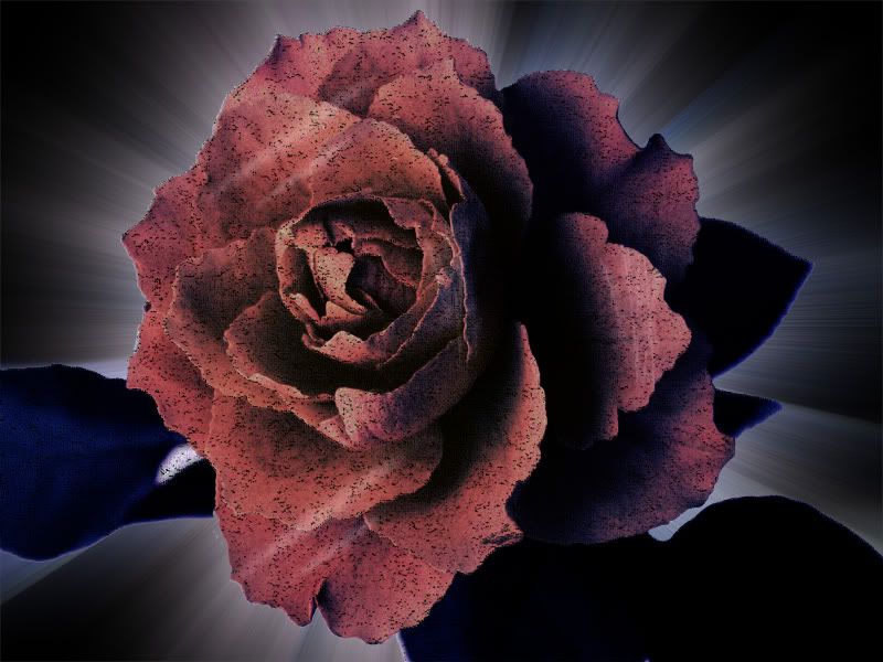
    Eh, I was messin' around with a stock photo of a flower, and I liked the results. I hope someone here likes it as much as I do...


    I'll post the stock in a bit... but I gotta find it... lol... Please rate though. I'm such a noob to this kinda stuff... I want tips more than anything please...

  2. #2
    Join Date
    Feb 2005
    Posts
    2,921

    Default

    thats the official competition one...

    if i were you i wouldnt use it but i dont think that we should be helping you since its for an official competition

    plus you obviously know where you got the stock but you still say "I'll post the stock in a bit... but I gotta find it... lol..."

  3. #3
    Join Date
    Jan 2005
    Posts
    563

    Default

    *edit*

    shouldnt comment on cometition entries
    / / X E K A Y E M \ \
    http://zekayem.deviantart.com/

  4. #4
    Join Date
    Mar 2005
    Posts
    254

    Default

    yeah, I got it from that post, and I tried to find it... I didn't do it for the comp though, I was just screwing around...


    so go ahead and critique...

  5. #5
    Join Date
    Feb 2005
    Location
    United Kingdom
    Posts
    2,435

    Default

    Im not to sure on the gritty substance on the flower. Maybe if you give it a colour burn blending mode it will look better. Keep working, its good for your level of experience.

  6. #6
    Join Date
    Jan 2005
    Posts
    128

    Default

    i dont think thte background works with the grungey type feel to the flower, but all of the separate bits look nice. well done on the most

  7. #7
    Join Date
    Mar 2005
    Posts
    219

    Default

    Eh i dont like the stuff on te flower itself x.x

  8. #8
    Join Date
    Mar 2005
    Location
    Insanity Sq.
    Posts
    3,811

    Default

    pretty good, keep on tryin tho. your gettin better dude, i can tell! gj
    If you want help...
    Screw you
    If you make sigs...
    Screw you

  9. #9
    Join Date
    Jan 2005
    Location
    Wiltshire.England
    Posts
    6,351

    Default

    Ooh i like the dirt on the flower, it reminds me of iron filings on a magnet in scxience o.o ( wwee done magnests n' stuff a couple of lessons ago ) . Nice job, i think the background could be better though, maybe grunge.


    Cool colours , and i like the lights on the flower. Well done.


  10. #10
    Join Date
    Mar 2005
    Posts
    254

    Default

    Thanks for the comments guys. Seriously. I'm trying really hard to steer away from using tuts and stuff. Cuz I never experiment with them. that's a huge downfall of mine. But I appreciate how you guys were willing to take time to post criticism. This is like the most replies I've ever gotta from a piece that I've done from any of the message boards that I go to... (or used to for that matter)

    Thanks again...

Similar Threads

  1. the flower
    By Sumomo in forum Sigs & Manips
    Replies: 2
    Last Post: 01-08-2006, 07:09 PM
  2. Flower
    By Dick in forum Digital Art
    Replies: 9
    Last Post: 07-17-2005, 08:18 PM
  3. Flower Sig and Ava
    By ROTD in forum Sigs & Manips
    Replies: 25
    Last Post: 04-10-2005, 10:35 AM

Posting Permissions

  • You may not post new threads
  • You may not post replies
  • You may not post attachments
  • You may not edit your posts
  •  
Powered by vBadvanced CMPS v4.1.1