GFXVoid Graphic Design Forum

Remove Text Formatting
Loading...

» Online Users: 4,208

0 members and 4,208 guests
No Members online

» Site Navigation

 > FAQ

» Stats

Members: 35,442
Threads: 103,075
Posts: 826,688
Top Poster: cc.RadillacVIII (7,429)
Welcome to our newest member, Lekelindids
Results 1 to 5 of 5

Thread: Smoker

  1. #1
    Join Date
    Aug 2007
    Location
    Philippines \m/
    Posts
    331

    Default Smoker

    My first signature this year 2008 lol


    Comments pls.


    Proud Member Of MasterWorks® Family

  2. #2
    Join Date
    Oct 2006
    Location
    Sweden
    Posts
    221

    Default

    I don't like the white on both sides =/ it's maybe too contrast..? looks nice otherwise, like the text gj!
    [
    -
    ]


  3. #3
    Join Date
    Nov 2007
    Location
    West Sussex, England
    Posts
    39

    Default

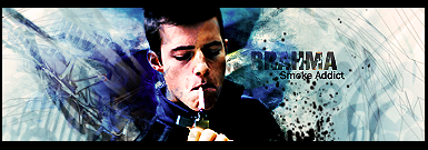
    I really like it! There's some unique 'scratchy' effects going on at the sides and the way you have blended the render into the background is really smooth and pleasing. Nice use of colours, too!

  4. #4
    Join Date
    Mar 2007
    Location
    Denmark
    Posts
    4,197

    Default

    Text is well done and fit the theme of this. I would have blended his left shoulder a bit better either by using eraser or with a clipping mask. nice job


  5. #5
    Join Date
    Aug 2007
    Location
    Philippines \m/
    Posts
    331

    Default

    Thanks for comments! glad you like it


    Proud Member Of MasterWorks® Family

Posting Permissions

  • You may not post new threads
  • You may not post replies
  • You may not post attachments
  • You may not edit your posts
  •  
Powered by vBadvanced CMPS v4.1.1