0 members and 3,848 guests
No Members online

» Site Navigation

» Stats
Members: 35,442
Threads: 103,075
Posts: 826,688
Top Poster: cc.RadillacVIII (7,429)
|
-

Made this some time ago. The original picture is taken from http://www.polykarbon.com.
And yeah, the colors are a bit gay. :P
I wasn't that good with Photoshop when I made this, so I didn't bother to made the lines smooth and stuff like that. I regret it now, but I will of course not edit it. 
Original:
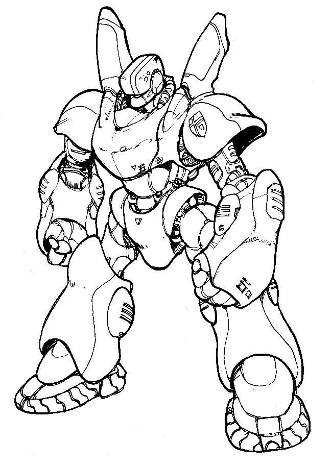
Colored:

Please comment. 
-
I think that is great. :lol: I like the lines the way they are, they make it seem like you cut it out straight from a comic book.
Props to the original artist too, nice mech.
-
Thanks.
The original artist makes good manga drawing tutorials too, check it out.
-
I think that it is very good! The colours you choose I think were a good choice.
-Whitegecko-
-
I would have to agree with white on that one. The colours are great, very contemporary. The edges of he robot are a bit rough, is it meant to be like that?
9/10 Keep up the good work!
-
Thanks.
I wrote it in my first post. I didn't bother to them when I made it. If I would have made it NOW I would have made the lines smoother. ^^
-
Yeah..the colors don't really go to well..but I can't think of anything that would...the lines being choppy just add to the cartoon effect in my opinion..I like it good job..8/10
-
i like it, maybe you couldve made the crest on his shoulder red, to amtch his eyes and add in a little bit mroe red in there to make things stand out, but other than that its great!
-
-
amazing, man i need some tips on coloring, cuz im horrible at it!
If you want help...
Screw you
If you make sigs...
Screw you
 Posting Permissions
- You may not post new threads
- You may not post replies
- You may not post attachments
- You may not edit your posts
-
Forum Rules
|


 Reply With Quote

