0 members and 600 guests
No Members online

» Site Navigation

» Stats
Members: 35,442
Threads: 103,075
Posts: 826,688
Top Poster: cc.RadillacVIII (7,429)
|
-
 Unreal Tag Unreal Tag

 Proud
Proud Member Of MasterWorks® Family
-
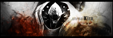
Of course I like v1 more  .. hm, I dont know that to say, but I like it very much.. Good job .. hm, I dont know that to say, but I like it very much.. Good job
-
I like it - it could use a warm filter though .)
-konfusion
-
EIther use the Black and white one or add a filter liek konfusion said.
Without it the flame looking things next to the render attract too much attention, Ya know since the render is black and white and all.
Nice job though i like it a lot. The background works great, the text works, the border is great and you go some good depth going. Nice job.
 My DevART
RATCHET is my bitch
Andrew says:
u ever stolen a bible?
Apathy says:
no
used the last two pages to roll a joint though
Andrew says:
wow
thats fucking hard core
^^HAHAHA, dm sucks XD
-
-
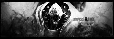
needs a warm filter i believe that has been said before
text needs to be shifted to the right a bit
transitions aint great
and needs a small lighting source above his left shoulder(when you look at screen)
its very nice tho, love the simplistic effects and all
keep it up.
:Latest:

:Favorite:

-
I say version 2 just make the render stand out a tiny bit more and ill love it. Great job doesn't know what to improve
Similar Threads
-
By GodsSon in forum Sigs & Manips
Replies: 1
Last Post: 06-30-2007, 05:34 PM
-
By DragonsRage in forum Sigs & Manips
Replies: 9
Last Post: 09-25-2005, 10:11 AM
-
By Krimsyn in forum Sigs & Manips
Replies: 6
Last Post: 08-28-2005, 03:17 AM
-
By Juicy in forum Sigs & Manips
Replies: 5
Last Post: 05-29-2005, 01:44 PM
 Posting Permissions
- You may not post new threads
- You may not post replies
- You may not post attachments
- You may not edit your posts
-
Forum Rules
|


 Reply With Quote


