0 members and 548 guests
No Members online

» Site Navigation

» Stats

Members: 35,442
Threads: 103,075
Posts: 826,688
Top Poster: cc.RadillacVIII (7,429)
|
-
 Latest Latest

CnC appreciated
-

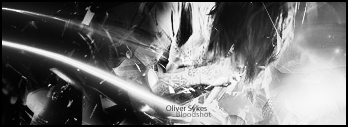
pretty cool and the text is spot on..Very good. However i recommend you blur all of them except one. Because there is no focus right now. It keeps your eye moving all the way around the sig. besides that though it's cool.
 My DevART
RATCHET is my bitch
Andrew says:
u ever stolen a bible?
Apathy says:
no
used the last two pages to roll a joint though
Andrew says:
wow
thats fucking hard core
^^HAHAHA, dm sucks XD
-

Nice..  is this is a stock? can we see it? is this is a stock? can we see it?
-

DOOOOOOOOOOOOOOOD THIS IS ORGASMIC, I LOVE YOU SO MUCH!!! I LOVE THE LITTLE FACELESS DUDES, OMG OMG OMG OMG SWEEEEEEEEEEEEEEEEEEEET
dunno why i like it i just doooo
text shouldnt be as white as it is, and the ground on the right shouldnt be as faded white as it is, needs some more darkening and grain like the marble floor to it
ANYHOW!!
EXTREMELY SICK JOB I LOVE YOU AND I JUST HAD THE BEST GRAPHIC ORGASM OF MY LIFE OVER THIS THING
dunno why tho
9.9/10!!
:Latest:

:Favorite:

-
-

Yea, excellent job for creativity alone.
-

Is it a stock or did you create those its a good sig and the text is spot on. i agree with papa blur all and leave one left should create a good focal and some depth. gj
Similar Threads
-
By LancerEvo in forum Sigs & Manips
Replies: 3
Last Post: 08-21-2007, 12:46 PM
-
By kemo in forum Sigs & Manips
Replies: 3
Last Post: 05-02-2007, 05:56 PM
-
By resin in forum Sigs & Manips
Replies: 6
Last Post: 02-13-2007, 11:37 PM
-
By shyonne2004 in forum Sigs & Manips
Replies: 4
Last Post: 10-07-2005, 12:31 AM
-
By whutitdew in forum Sigs & Manips
Replies: 10
Last Post: 10-02-2005, 11:27 PM
 Posting Permissions
- You may not post new threads
- You may not post replies
- You may not post attachments
- You may not edit your posts
-
Forum Rules
|

