Yeah one thing i learned is no matter what clan leaders/members say etc. Don't listen to em. They have no graphic or artistic taste, and want whatever they think will look most "pimp" or "tight".
Good choice going with the Black and white border, really benefits the sig.
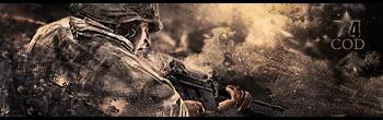
nice BG and the blending is flawless. GJ.
hey. im really not sure how this site works.. rules etc.. (found this link from google)
anywho..
id prolly refer to myself as a photoshop newbie when i see this kinda work but anyway.. im looking to improve - im not sure if im lacking artistic inspiration, skills or material (brushes/ renders etc.) or all of the above..
[Don't post your stuff in someone elses thread pls create your own]
Yeah one thing i learned is no matter what clan leaders/members say etc. Don't listen to em. They have no graphic or artistic taste, and want whatever they think will look most "pimp" or "tight".
Good choice going with the Black and white border, really benefits the sig.
nice BG and the blending is flawless. GJ.


 Reply With Quote


