0 members and 1,601 guests
No Members online

» Site Navigation

» Stats

Members: 35,442
Threads: 103,075
Posts: 826,688
Top Poster: cc.RadillacVIII (7,429)
|
-
 Queen of Hearts Queen of Hearts
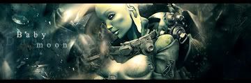
was trying out Daemon's FF tut and misunderstood it 
But, I kept going cause what I started kinda look interesting so I just went with it.
I'll try again the right way, but I figured I'd post results of botched attempt 
(you kept saying "add new stock", so I kept adding a different stock each time as opposed to the same).

-

GARIS - SILENTSHADOW - DAEMON
PAPA - JORRNE - GOAT -IMMORTAL_TEKNIQUE
-

 Originally Posted by Bloodtears

WOw.... work on text.
Bloodtears, that is a very unhelpful comment to the original poster. People come here wanting to learn and so when they get critique saying stuff liek that it doesn't help.
Eventually everyone has an off day though and they kind of lose their cool. So dw about it blood.
Onto the sig.
Deamon will prolly post here in a few and maybe say what he meant?
I think the bg needs to blended a bit more to the render/stock can't tell which it is. I would say try to overlap some of it onto the render.
Also i don't know if you blurred teh BG at all but you might want to get rid of some of the blur. Just lighten it up a bit.
You should add a couple of clipping masks to this. It would blend the render more and also it would help liven up the sig a bit. If you don't lknow how to create a clipping masks just ask and I'll tell ya. However its a bit of a lengthy thing so i won't put it in now.
Finally when using text there are 2 rules to know.
1. use default fonts.
These fonts will tend to look better than any other font you can download, and until you pretty much master typography it will help you loads to just use default fonts.
2. keep it small.
Your size right now is pretty good but i wouldn't try to go much bigger.
Also i would get rid of the gradient on the text it makes it stand ou a lot mroe than it should. Typically i just wouldn't use blending options on text.
Also i would try to make it Black and white to make it blend more.
But it's an alrigth sig just keep working at it and you will get it. If you need any help just ask.
 My DevART
RATCHET is my bitch
Andrew says:
u ever stolen a bible?
Apathy says:
no
used the last two pages to roll a joint though
Andrew says:
wow
thats fucking hard core
^^HAHAHA, dm sucks XD
-

Lol, that's cool Bloodtears.
I think I've only ever had good text on like 2 sigs so far 
I kinda just threw that on.
Thanks for the comments Papa.
The BG is Gaussian blurred (to try and add some depth).
There's 3 renders in there, but the girl on top should be the focal.
I'll try and work on it some more.
Gonna try his tut again, he just has me a bit confused on how he jumped from a black filled layer in step 1 to what looks like a pretty much completed BG with a render in it, unless he's using a stock that's the size of the entire canvas and just just a render of the character...
probably would help if he included what renders/stocks he was using in the tut.
-

Well when i say add a new stock, i mean add a new kewl looking stock on a new layer and then erase what you dont like in it, and then put the layer on the blending mode the tutorial says 
And i wont repeating what papa just said so im gonna say i agree with him 
-

so you were using a completely different stock each time?
-
-

Wow. That's a great signature. Try adding a few c4ds.
-

soz :3
Anyway, I like the placement of the text ^.-
Sry I didn't say anything else than that :P
wellwell,
1. Bevel and emboss isn't good at all
2. The color of the text is wrong, since the bg doesn't have a color, the text shouldn't, also, if the color of the sig is, let's say, brown, the text should be brown too (or white), for example. try lowering opacity to 30-70% depending, or just soft light or overlay.
3. Try going through some brushing background tuts, if this sig was supposed to look like that, try not blurring the right side so much. also, since the right side of the bg is dark, it looks like its a big hole between the girl and the bg, so that doesn't rly fit either :P
GARIS - SILENTSHADOW - DAEMON
PAPA - JORRNE - GOAT -IMMORTAL_TEKNIQUE
Similar Threads
-
By pearlized in forum Sigs & Manips
Replies: 5
Last Post: 04-30-2007, 03:48 PM
-
By Horus in forum Digital Art
Replies: 15
Last Post: 10-26-2006, 08:29 PM
-
By MinorThreat in forum Sigs & Manips
Replies: 15
Last Post: 11-06-2005, 11:49 AM
-
By gugge in forum Digital Art
Replies: 10
Last Post: 10-09-2005, 09:43 AM
-
By Hazardous_Material in forum Digital Art
Replies: 9
Last Post: 06-19-2005, 07:43 PM
 Posting Permissions
- You may not post new threads
- You may not post replies
- You may not post attachments
- You may not edit your posts
-
Forum Rules
|


 Reply With Quote


