0 members and 7,381 guests
No Members online

» Site Navigation

» Stats
Members: 35,442
Threads: 103,075
Posts: 826,688
Top Poster: cc.RadillacVIII (7,429)
|
-
 A random car sig A random car sig
I have been trying out some things, thats what i got:

-
Looks alright too me... 
-
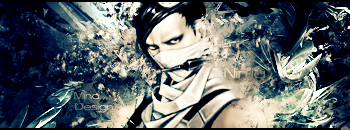
the cloudy thingy over the car on the right dont fit there.
but looking good text is sexeh.
gj
-
not bad, but i think too many effects covering the car.
-
^^STudhorse said it all. On the last layer duplicate the car render and erase some parts of it however leave a lot of it. That way you'll get rid of some of those effects over the car...There are just too many :P.
NIce BG and the text is pretty cool too so its lookin good, nice job.
 My DevART
RATCHET is my bitch
Andrew says:
u ever stolen a bible?
Apathy says:
no
used the last two pages to roll a joint though
Andrew says:
wow
thats fucking hard core
^^HAHAHA, dm sucks XD
-
yeah LIke what stud and papa said way to many effects, but it looks pretty cool
-
You are true
I think it looks much better:

-
Looks okay now ... great work i like the bg
-
second versions are great...
-
its a decent job, just a bit too much effects over the render, try to do what papa told you.
Similar Threads
-
By Oblivion in forum The Void
Replies: 12
Last Post: 02-03-2006, 09:54 AM
-
By KlngMe in forum The Void
Replies: 7
Last Post: 12-27-2005, 02:26 PM
-
By PenguinElitist in forum Digital Art
Replies: 3
Last Post: 08-31-2005, 10:17 PM
-
By HeadShot in forum Sigs & Manips
Replies: 7
Last Post: 07-23-2005, 05:19 PM
-
By MiNdFrEaK in forum Sigs & Manips
Replies: 3
Last Post: 05-17-2005, 08:20 AM
 Posting Permissions
- You may not post new threads
- You may not post replies
- You may not post attachments
- You may not edit your posts
-
Forum Rules
|


 Reply With Quote