0 members and 5,160 guests
No Members online

» Site Navigation

» Stats
Members: 35,442
Threads: 103,075
Posts: 826,688
Top Poster: cc.RadillacVIII (7,429)
|
-
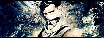
 Abomination from the new Hulk movie :) Abomination from the new Hulk movie :)
Do you like it?
Any tips to make it better?

-
its kinda dull maybe some more color?
-
Too dark ... maybe some effects behind and some lighting on render
-
make it lighter and you have a kick ass sig the darkness kills it a lil bit now... the darkness kills it a lil bit now...
but looking strong
-
 Originally Posted by silentshadow

make it lighter and you have a kick ass sig the darkness kills it a lil bit now...
but looking strong
Agree.
+ work on text. I would move it to the bottom.
-
Haha i didnt even see the text.. and now that i see it, i like it:P
-
When I was making this sig I tought it looks cool, but when i just checked again I tought the same as you do.
So, that's how I changed it:

I think this guy can beat you 
He must be angry coz, he can't buy a nice T-shirt.
-
V2 is MUCH better, however it's still a tad bit dark. As far as blending and effects go AWESOME job. It's looking very good and i would say its your best yet.
 My DevART
RATCHET is my bitch
Andrew says:
u ever stolen a bible?
Apathy says:
no
used the last two pages to roll a joint though
Andrew says:
wow
thats fucking hard core
^^HAHAHA, dm sucks XD
-
Thanks a lot! 
I can't really say more, i like it too
-
Similar Threads
-
By Creative in forum Sigs & Manips
Replies: 4
Last Post: 10-13-2007, 01:34 PM
-
By Devon in forum Sigs & Manips
Replies: 11
Last Post: 09-29-2007, 07:59 PM
-
By nazgul in forum Sigs & Manips
Replies: 8
Last Post: 02-15-2006, 10:16 PM
-
By angryjohnny in forum Sigs & Manips
Replies: 3
Last Post: 03-22-2005, 09:17 AM
-
By angryjohnny in forum Sigs & Manips
Replies: 15
Last Post: 03-22-2005, 04:57 AM
 Posting Permissions
- You may not post new threads
- You may not post replies
- You may not post attachments
- You may not edit your posts
-
Forum Rules
|


 Reply With Quote
 ::new::
 ::fav::