0 members and 706 guests
No Members online

» Site Navigation

» Stats
Members: 35,442
Threads: 103,075
Posts: 826,688
Top Poster: cc.RadillacVIII (7,429)
|
-
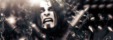
 Shagrath Shagrath
I'm back now ;]
plain
w/ border+text

EDIT:Text fix(opacity)

EDIT2:Text Fix 2
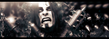
EDIT3:Clipping mask, bottom right :/
Last edited by nazz; 03-28-2008 at 08:37 PM.
-
-
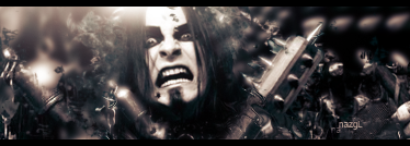
v2 ftw.
text looks good, tone it down just a teeny weeny bit.
looking good although i hate Dimmu Borgir:P although i hate Dimmu Borgir:P
-
-
Nice job. Kinda creepy but nice.
the text needs work though. Try a default font like aerial or eurose or something, you might find it blends better.
 My DevART
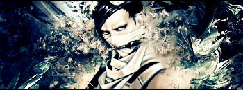
RATCHET is my bitch
Andrew says:
u ever stolen a bible?
Apathy says:
no
used the last two pages to roll a joint though
Andrew says:
wow
thats fucking hard core
^^HAHAHA, dm sucks XD
-
Definetly better blending on the text in the last one, however i think you might wanna seriously consider changing fonts. I can give you an example of what i mean if ya don't mind me touching your jpeg. a tad.
My DevART
RATCHET is my bitch
Andrew says:
u ever stolen a bible?
Apathy says:
no
used the last two pages to roll a joint though
Andrew says:
wow
thats fucking hard core
^^HAHAHA, dm sucks XD
-
Thats interesting .. Dimmu Borgir  nice sig ... last one looks best nice sig ... last one looks best
-
last one is sexy man nice work
-
really nice ;]
I love this one ;]
v3 or v4 ftw ;]
Similar Threads
-
By nazz in forum Sigs & Manips
Replies: 4
Last Post: 08-02-2007, 12:08 PM
 Posting Permissions
- You may not post new threads
- You may not post replies
- You may not post attachments
- You may not edit your posts
-
Forum Rules
|


 Reply With Quote


 ::new::
 ::fav::


