0 members and 7,448 guests
No Members online

» Site Navigation

» Stats
Members: 35,442
Threads: 103,075
Posts: 826,688
Top Poster: cc.RadillacVIII (7,429)
|
-
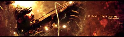
 Battlefield: Bad Company Battlefield: Bad Company
Cnc?
-
a bit bright..overcontrasted:P
nice brushing with the splatters..
nice attempt at pentooling..it looks nice..
and nice text..
love ur new style
-
 Originally Posted by Immortal.

a bit bright..overcontrasted:P
nice brushing with the splatters..
nice attempt at pentooling..it looks nice..
and nice text..
love ur new style
I don't know why but i love overcontrasted sigs. xD
It lacks a bit of depth though doesn't it?
-
tru..and yes i can tell u love overcontrasted sigs:P
-
The render is over contrasted, this sig is too but it's not deadly obvious. The reason it is so over contrasted is because it was already contrasted enough before you put it in the sig. When you were making the sig have more contrast you must have no masked out/erased the contrast on him. You must remember to do this otherwise you will have a LOT of lost details. :P
The text is pretty good though i'm not a fan of the font choice.
The blending is terrific, you nailed the blending, but as you said before there isn't asny depth :P. That's good you realized teh problem though because that shows you are always looking how to make your sigs better.
The lighting is a bit harsh and strong. I usually prefer larger dots of light so i can afford to make them softer. This isn't too bad you might wanna soften it a bit however.
Nice job overall, however you really need to watch out for the contrast. :P
 My DevART
RATCHET is my bitch
Andrew says:
u ever stolen a bible?
Apathy says:
no
used the last two pages to roll a joint though
Andrew says:
wow
thats fucking hard core
^^HAHAHA, dm sucks XD
-
Originally Posted by Papa
The render is over contrasted, this sig is too but it's not deadly obvious. The reason it is so over contrasted is because it was already contrasted enough before you put it in the sig. When you were making the sig have more contrast you must have no masked out/erased the contrast on him. You must remember to do this otherwise you will have a LOT of lost details. :P
The text is pretty good though i'm not a fan of the font choice.
The blending is terrific, you nailed the blending, but as you said before there isn't asny depth :P. That's good you realized teh problem though because that shows you are always looking how to make your sigs better.
The lighting is a bit harsh and strong. I usually prefer larger dots of light so i can afford to make them softer. This isn't too bad you might wanna soften it a bit however.
Nice job overall, however you really need to watch out for the contrast. :P
Again thank you very much papa. I really need to work on getting depth as well as blending. I'll try to soften the lighting in future sigs too. Also my contrast xD
Similar Threads
-
By Trikato in forum Sigs & Manips
Replies: 6
Last Post: 08-20-2007, 01:09 PM
-
By v3ct0rStripes in forum Digital Art
Replies: 9
Last Post: 01-27-2007, 01:26 AM
-
By Frozen in forum Sigs & Manips
Replies: 0
Last Post: 09-04-2006, 10:16 PM
-
By MetalSkin in forum The Void
Replies: 8
Last Post: 06-14-2005, 04:32 AM
-
By DarkStar in forum Sigs & Manips
Replies: 8
Last Post: 06-11-2005, 10:05 AM
 Posting Permissions
- You may not post new threads
- You may not post replies
- You may not post attachments
- You may not edit your posts
-
Forum Rules
|


 Reply With Quote

