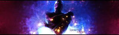
i like it although i do agree with sturd and aristo feels kinda empty although i don't have problems knowing its spider man ( it is right? lol xD) the over contrast sometimes makes me kinda loose focus idk but thats just me and my weird opinions xD lol and maybe add a lil something that makes the feel that he is like getting wrapped around
something or idk w/e i like though as alwasy great text
newest:
Fav :
The true and only Firescorpio!
(no autographs please)
I would say maybe make the outer color a little dark for looks maybe, but definatly better; love the pen tool effect as well, need to learn how to use the pen tool.
maybe take a soft brush and brush on the edges in black to give it a depth and some edging just look at the psd for our sig when i send it to ya its a quick mask on the backround folder
::new::
::fav::
Originally Posted by Papa
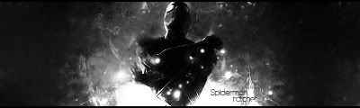
I would have prefered to see some M-birds in there. But overall pretty slick :P


 Reply With Quote


 ::new::
 ::fav::


 its a quick mask on the backround folder