0 members and 2,041 guests
No Members online

» Site Navigation

» Stats

Members: 35,442
Threads: 103,075
Posts: 826,688
Top Poster: cc.RadillacVIII (7,429)
|
-
 First one First one
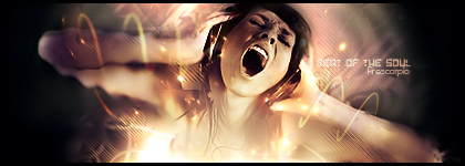
I am a new GFx designer, and here is my first design.

-

Not bad, cant really see the render that well, and as for text normally a default windows font works. For a first one though nice.
-
-

for being ur first it looks pretty good the smudge for the background gives out sort of a dreamy effect and looks good u could have erased with a soft brushed ur smudged the render a bit into the background so it next time it won't look so stamped in. , something that is bothering me that weird thing next to its face looks really out of place u might want to take it out, as for the sig itself its a bit to monotone and sometimes to monotone can become boring, since its a soft color and theres not much going around in it doesn't catch my attention as it should try adding some coloring gradient maps photo philters etc to create a more lively ambiance to ur sig also u might want to add a light source to the sig that always helps to get into a mood also try making the text smaller u dont want it to take focus away from your focal point the cruzader u want ur focus to go into him the rest just as a flow of whats going on with him there might be something else idk thats mi little grain of sand keep em coming and pls dont think of me as an ass xD lol just trying to help out the best way i can lawlz overall for it being ur first one it looks good go aorudn the tuts around the page they are really good try papa's or daemons tuts they are pretty good
newest:

Fav :

The true and only Firescorpio!
(no autographs please)
-

This sig is pretty good for it being your first. I like the minimalistic style of it.
Compositionally i think it would be more pleasing if you scooted the render over to the left about 10-15 pixels (maybe about your thumbnail's length over).
The coloring is okay, it blends with his skin tones pretty well, however i don't know if i would have picked that to be my main color. IMo i would have gone with the armor, like a nice gray blue.
The blending is pretty good, though I'm having a hard time seeing the render because he seems like a little soft or something. A way to fix this is to duplicate the render layer. Move him to the top of the layers pallet and then erase the sides.
As said before, stick to default fonts it will help you work wonders. I reccomend you read a few signature tutorials. I highly recommend mine, daemon's and ilovecoheed's.
Also you should read this:
Darkmethod'S guide to text
it'll help you with your text a lot.
 My DevART
RATCHET is my bitch
Andrew says:
u ever stolen a bible?
Apathy says:
no
used the last two pages to roll a joint though
Andrew says:
wow
thats fucking hard core
^^HAHAHA, dm sucks XD
-

Should read a couple of Papa's also, they give some pretty cool effect ideas
-

and daemons...they help ur smudging techniques even more...XD
-

I will find a tut, and post it later.
-

hehe thx from me and papa you guys  ;p hehe yearh for your first this is decent, well keep going the others pretty much summed it up ;p hehe yearh for your first this is decent, well keep going the others pretty much summed it up
-

 Originally Posted by Daemon

hehe thx from me and papa you guys  ;p hehe yearh for your first this is decent, well keep going the others pretty much summed it up
I saw some of your tuts, they are good. Do you got any beginner tuts?
 Posting Permissions
- You may not post new threads
- You may not post replies
- You may not post attachments
- You may not edit your posts
-
Forum Rules
|


