0 members and 5,765 guests
No Members online

» Site Navigation

» Stats

Members: 35,442
Threads: 103,075
Posts: 826,688
Top Poster: cc.RadillacVIII (7,429)
|
-

EDIT: I forgot to put Slim...heavystarch is my name on another site i made this for.
The brushes used in this are Metal's Abstract90. I recommend getting some other brushes from Metal too because we all know Metals brushes are some of the best.
Ok this is my first full sig tut so youll have to bear w/ me...ummm im basically going to try and walk you through my way of making sigs.
Well first i almost always start off by making a 330x125 sig and make it a plain black bg.

Then once you have your black bg select and abstract brush you like and get a sorta big brush and make one brush mark on it kinda like this.

Then to give that brush a bit of depth i make some more brush layers on overlay over that one...

Then once you have some depth to the first brush add another white brush. I like to try and leave it still kinda black on the left side, but you dont have to if you dont want to. Heres what the second brush should kinda look like.

Then once again add 2 brushing layers on overlay to give this brush some depth. Make one layer white brushing and one black brushing.

You should have something that looks somewhat like this, it will look different depending on what brushes you use.

Now its time to add a render. I chose to use this Demon Hunter render from blizards website found here http://www.blizzard.com/inblizz/fanart/Scr...Index=015&Set=0
I just cut the render out and duplicated it and set the second layer to hard light. I like hard light because it tends to give most renders some good immediate depth.

Now to add some color. Make a 2 color balance layers above everything. made one red and one blue. Then on each color balance layer do filter>render>clouds.

-

Now make 2 more color balance layers, another red one, and a greenish/blue one. Again be sure to filter>render>clouds each of the layers.

Now duplicate your render and set it Linear Burn, and then set it over your color balance layers.

Now with the second 2 colorbalance layers not showing make a merged layers of everything by pressing CTRL+A, CTRL+SHIFT+C, CTRL+V. Then you should have a layer of everything you have done on top. Then i used the burn tool on some places to darken up the edges a bit. You should have something that looks like this now.

Now with all 4 color balance layers selected do the same thing, as before and merge all the layers. Then set that merged layer to color and 35% opacity.

You should have something that looks like this now.

Now we can add our text. I used Acens for this one, and set it to bold. Heres what my text looked like.

Now duplicate each text layer and set each one to a horizontal motion blur at around 20, or whatever you think looks best. Remember to set the motion blur layers under the original text.

all thats left is the border for this one ill just do a 1 px black border...there are different ways of doing this, i just zoom all the way in and use the pencil tool and go around the edges. If you do this remember to hold shift down while doing this to make strait lines easier.

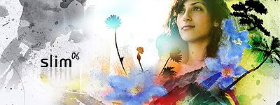
Heres the final product:

Well that pretty muchconcludes my tutorial. I hope you enjoyed it and i hope it helps you. If you feel that i left out a step somewhere along the way just let me know and i will do my best ot include it.
-

Umm dunno about the content, and good work for the try, but come on dude your way of capturing is almost insulting to dial-uppers. i'd have to wait hours to load all this... you dont need to show us the whole screen again and again.. jus cut the parts we need to see...
whatever, good job that you cared to make a tutorial i guess :}
-

those are sweet brushes, could you link to them? nice tut, its about abstract, which is what i was waiting for 
and yeah, those screenshots take forever, crop them down to the neseccary parts.
-

wow, very nice man, I love the result BTW
-

That render owns! Nice tut.
-

nice tut ill give it a try tomorrow
-

Nice tut and i didnt have a problem loading the images. But then again i have cable. 
-

Thats a very good Tut man !!!!
-

i got adsl and no problem for me neither  gj on the tut gj on the tut
 Posting Permissions
- You may not post new threads
- You may not post replies
- You may not post attachments
- You may not edit your posts
-
Forum Rules
|


 Reply With Quote


![Send a message via MSN to Em][n3m](http://www.gfxvoid.com/forums/images/misc/im_msn.gif)


