GFXVoid Graphic Design Forum

Remove Text Formatting
Loading...

» Online Users: 19,226

0 members and 19,226 guests
No Members online

» Site Navigation

 > FAQ

» Stats

Members: 35,442
Threads: 103,075
Posts: 826,688
Top Poster: cc.RadillacVIII (7,429)
Welcome to our newest member, Lekelindids
Results 1 to 5 of 5

Thread: 2 manips

  1. #1
    Join Date
    Jun 2005
    Posts
    134

    Default

    hey guys what do you think of these 2 manip sigs i did for friends:

    1. original:(just a litle part off of a wallpaper)

    manip:
    ---------------------------------------------------
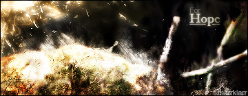
    2. original:http://i6.photobucket.com/albums/y22...larr/Hills.jpg

    manip:

    my first manips i guess...

  2. #2
    Join Date
    Apr 2005
    Location
    Greece
    Posts
    563

    Default

    The second one is so much better. It's actually great. The first is ehhh.

  3. #3
    Join Date
    May 2005
    Location
    elsewhere
    Posts
    76

    Default

    both are very nicely done. the first one got a real nice rough, grungy feel to it, while the second one is quite the opposite.
    your nickname on the first one doesn't look too good to me tho'. perhaps you should try to change it to vertical.

  4. #4
    Join Date
    May 2005
    Posts
    336

    Default

    Your first one is good for what you had to work with with the original, but the second one is really really nice. Good job on those.

  5. #5
    Join Date
    Jun 2005
    Posts
    134

    Default

    thanx guys

Posting Permissions

  • You may not post new threads
  • You may not post replies
  • You may not post attachments
  • You may not edit your posts
  •  
Powered by vBadvanced CMPS v4.1.1