0 members and 4,633 guests
No Members online

» Site Navigation

» Stats
Members: 35,442
Threads: 103,075
Posts: 826,688
Top Poster: cc.RadillacVIII (7,429)
|
-

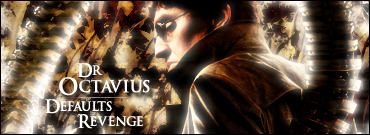
Made these 3 today, the 1st is my 1st attempt at a default brushing sig 


-
They all look good, second is best. Blend it more and it'll be sweet
-
I like your 2nd one and last one the best.
-
I like the 2nd one the BG is really nice on it...
-
where can i get a tutorial on those blury shines on ur sigs couse i cant make one please teach me or give me a link, thx in advance 
btw really nice sigs man the second one is awesome but ur current one is one of the best sigs i've ever seen!
-
they are all nice but the renders are all to cuttet for me blend it a bit more ....gj though
 I am the master of my soul and i am the master of my faith!
-
Originally posted by Shark00n@Jul 5 2005, 08:20 PM
where can i get a tutorial on those blury shines on ur sigs couse i cant make one please teach me or give me a link, thx in advance
btw really nice sigs man the second one is awesome but ur current one is one of the best sigs i've ever seen!
[snapback]52651[/snapback]
I usually duplicate the render and set it on hard light, duplicate it again and then set it to screen, then go Image, Adjustments, Threshold leave it with the default settings, then go Filter, Blur, Gaussian Blur with a setting of something low such as 2-3 pixels it usually depends on the render.
Then it's a case of changing the opacities of the layers to get something you like, usually the top layer (the Screen one) is too bright, so you may wish to reduce the opacity down.
-
i really dont like the second one,worse of the 3 in my opinion.I like the third one the most,although none of them look very good.The backrounds just look like someone whos new to photoshop would make.Love your current though.
-
Originally posted by fade to black@Jul 5 2005, 10:08 PM
The backrounds just look like someone whos new to photoshop would make.
[snapback]52683[/snapback]
You mean just like your current ")
-
precisely,i wasnt trying to sound like a jerk,just some comments.
 Posting Permissions
- You may not post new threads
- You may not post replies
- You may not post attachments
- You may not edit your posts
-
Forum Rules
|


 Reply With Quote
