GFXVoid Graphic Design Forum

Remove Text Formatting
Loading...

» Online Users: 6,562

0 members and 6,562 guests
No Members online

» Site Navigation

 > FAQ

» Stats

Members: 35,442
Threads: 103,075
Posts: 826,688
Top Poster: cc.RadillacVIII (7,429)
Welcome to our newest member, Lekelindids
Results 1 to 8 of 8
  1. #1
    Join Date
    Jun 2005
    Posts
    157

    Default


    CnC + Current?

  2. #2
    Join Date
    Apr 2005
    Location
    BAVARIA
    Posts
    362

    Default

    Cool one i like the coloring alot damn hot feeling like into hell :P

    current it


    I am the master of my soul and i am the master of my faith!

  3. #3
    Join Date
    May 2005
    Posts
    84

    Default

    i ****ing love the sig!a

  4. #4
    Join Date
    Jun 2005
    Posts
    244

    Default

    nice,but maybe it woulda been better if the bright circle ball thing was in the center,ti create a better focal point

  5. #5
    Join Date
    May 2005
    Posts
    65

    Default

    one thing dude.. suprised noone picked up on it.. u forgot the "c" in "function"

    its really nice otherwise

  6. #6
    Join Date
    Apr 2005
    Location
    Pittsburgh, PA
    Posts
    1,106

    Default

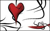
    It looks like there is more going on on the left side then the right. Might want to make it a bit more even on both sides, but hey, it's your sig and your art, you can keep it how it is.

  7. #7
    Join Date
    May 2005
    Posts
    35

    Default

    its nice i like it alot

  8. #8
    Join Date
    Jul 2005
    Posts
    101

    Default

    I also like it a lot, but I agree with Swagger when he says that there is a lot going on in the left side of the sig, but other than that, it's great.

Posting Permissions

  • You may not post new threads
  • You may not post replies
  • You may not post attachments
  • You may not edit your posts
  •  
Powered by vBadvanced CMPS v4.1.1