0 members and 11,541 guests
No Members online

» Site Navigation

» Stats
Members: 35,442
Threads: 103,075
Posts: 826,688
Top Poster: cc.RadillacVIII (7,429)
|
-


gazo: image placing, text
me: rest
turned out cool
-
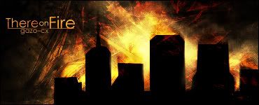
this is my part of the collab :P
-
-
the big sig looks better imo, gj. Nicely done
-
Yeah, same here, I think the big one looks better, but nice one metal, u just didnt touch it this time though....
-
hmmm i preffer the small one, overall as a better final quality to it.
Whitout beeing too explicit it works, we see right away what it's all about.
The problem for me with the big version is the bg
-
Yea I also like the one big one better. But, I like metal's better overall because he spelled "they're" correctly :P
-
Actually there wasn't an apostrophe so he didn't spell it correctly lol, but overall I prefer Metal's version. It's better composed and I like the textured brushing. I, however, feel metal's sig is a little too small.
-
Sweet sig!!!! I'd give it a 9/10!
-
i like the colors and the decent brushes in bg nice one...
its like a city in a big cave under earth 
 I am the master of my soul and i am the master of my faith!
 Posting Permissions
- You may not post new threads
- You may not post replies
- You may not post attachments
- You may not edit your posts
-
Forum Rules
|


 Reply With Quote


