0 members and 12,139 guests
No Members online

» Site Navigation

» Stats
Members: 35,442
Threads: 103,075
Posts: 826,688
Top Poster: cc.RadillacVIII (7,429)
|
-

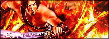
It took me forever to do this one. I think it's my best one so far. I used more tools and such. Anyway, here it is. Comments please, I really want to know what you guys think.
-
In truth the bg hurts my eyes a bit. I think its to strong of a red color for the stock as well. Typo needs work, both of them, and I would work on smoothing out the background some, its far to sharp.
-
Geez just as well i did it all over again isn't it? It's hard to please you guys on this site :P
-
Nah I wouldn't do it all over. Maybe just make a layer between the color layer and the brush or render layer and brush some white on overlay or something in there so it smooths things out a bit. That or just smudge the brushing a bit (probably work best). so its not as sharp and add a color balance layer over the top and kind of mix in another color..skin tone maybe.
-
Yea okay thanks. ^_^ I changed it around a little. Look better than before?
-
Bit to much white brushing. Bring down the opacity some. Though its not as much of a strain on the eye now at least. Did you add the color balance layer?
-
Yea I did .. and did the skin-tone color like you said.
-
hmm. Damn. Trying to think how to make it better but its a bit tough since I can't see the PSD. The typo still needs work I would say fix that, maybe put it on the right side in the empty space to use your space abit better, then put a border on it and call it finished.
-
I don't know. It doesn't fit anywhere else, I've tried it everywhere, with every font I have, with every size. It just doesn't work anywhere else. To be honest, I think it looks fine where it is imo.
-
Its alright, bg seems alittle to contrasted.
Biggest question of all, why is the blade PINK?
 Posting Permissions
- You may not post new threads
- You may not post replies
- You may not post attachments
- You may not edit your posts
-
Forum Rules
|


 Reply With Quote

