


im entering this into a battle on another site against someone who is very good, so any help would be appreciated.
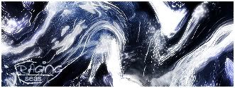
v1:
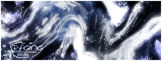
v2:
i went for something original on here..like a painting maybe. there was NO brushing involved, this is all filter work.
best one? ??/10? CnC?
thanks guys :wub:

 Reply With Quote


