0 members and 6,515 guests
No Members online

» Site Navigation

» Stats
Members: 35,442
Threads: 103,075
Posts: 826,688
Top Poster: cc.RadillacVIII (7,429)
|
-

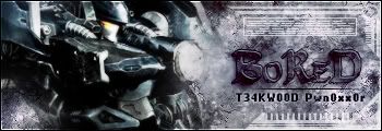
b0r3d
Ardeo

First to seven votes wins, no voting for yourself, provide a reason with your vote or it will not be counted.
GL and HF :lol:
-

bor3d more contrast text fits better :/
he's a lil more advanced I think but is close match not like me and him perhaps that's like me going against metal LOL... both needs improvement  but bor3d gmv sry ardeo... but bor3d gmv sry ardeo...
-
Don't think to high and mighty of you're self there EJ. Your not that good :P
But I gotta go with bored, seems like he put alittle more effort into it.
-
Originally posted by Cenoix@Jul 18 2005, 01:08 PM
Don't think to high and mighty of you're self there EJ. Your not that good :P
But I gotta go with bored, seems like he put alittle more effort into it.
[snapback]58074[/snapback]
I know but u see me again him is way too much off...
-
b0red gmv bcause its more appealing more contrast like some1 said
-
b0red GMV, ardeos render is blended in 2 much and not much contrast sry
-
OH CRAP! I POSTED THE WRONG SIG FOR ME! ****!!!!!!!!!!!!!!!!!!!!!!!!!!!!!!!!!!!!!!!!!!!!!! !!!!!!!!!!!!!!!!!!!!!!!!!!
Oh well, i'll use the one i was supposed to in my next battle, lol, i'm gonna get absolutely pwned
-
b0r3d. His text fits better, colors are better, overall it just looks much cleaner and nicer.
-
bored the text is nicer also the BG fits in really well with the render and it has a nice tech feel about it
bored gmv
-
both are not my style but b0r3d gmv cuz his is more detailed..
 Posting Permissions
- You may not post new threads
- You may not post replies
- You may not post attachments
- You may not edit your posts
-
Forum Rules
|


 Reply With Quote