0 members and 7,270 guests
No Members online

» Site Navigation

» Stats
Members: 35,442
Threads: 103,075
Posts: 826,688
Top Poster: cc.RadillacVIII (7,429)
|
-

I don't know if you guys have come across 3P before (3rd Perspective) but it's a graphic style of which seeks coherence; everything must be one. Everything must be realistic, with a slight edge accustomed to whom practises this art. Everything is taken into consideration; perspective, depth, light, shadows, texture, even elements such as wind. The most important thing is that there are no seperate principles, for example, if there's text, it must be one with the environment.
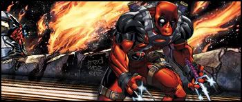
Anyway, enough of that, here's a sig I whipped up a little while back, took about 6 hours, once again only defaults used.
CnC welcomed as always. Cheers in advance, Tred.
-
wow that is beautiful I love it great job.
-
3p?Never even heard of it,sounds more like Realism the way you described it
-
Originally posted by fade to black@Jul 23 2005, 03:23 AM
3p?Never even heard of it,sounds more like Realism the way you described it
[snapback]60344[/snapback]
Yeah it kinda is, but it's different, people impose their own take or style within 3P. I'd like to show you some more stuff man, judging by your current sig you'd be ****ing awesome at it. What's your msn?
-
that sig is so nice i really like the main character in it you should current it
-
Tredici, I whipped that sig up for Fade real quick. Modelled the palette and brushed the rest.
Anyway, I suppose its your preference, but I'm not a big fan of it. Its the content that bugs me and as you said, being that its all coherent, if one doesn't like something, one probably wouldn't be a huge fan of many of the other aspects. I dont like the lightsource very much because it seems way too ambient. Like its coming from everywhere rather than a real source. Did you make it from scratch? If so, good job, impressive. If not, could we see what you had to work with?
-
Well for one I've gotta say your modelling techniques are spot on, also, shadowing on multi-angles is damn difficult, you've seemed to pull it off well.
And about this light source you mentioned, I, personally, am overawed at your observance. The thing with this sig is I've tried to make it somewhat outergalaxy-like. The flames in the background were intended to depict some form of explosive reaction close to the planet of which the characters are situated, hence the glow on top of the rocks, and the surprised look on the red character's face. The illuminated platform wasn't supposed to show light reflections, more as if it's it's own light source.
As always I appreciate your incredibly in depth critique  And I used two renders with this, I'll find them and host them real quick. Cheers. And I used two renders with this, I'll find them and host them real quick. Cheers.
-
Here they are:
http://img202.imageshack.us/img202/4384/ca...adpool150jd.jpg
http://img202.imageshack.us/img202/9...awler056uz.jpg
I scaled down the second one so much so that it was unrecognizably blurred; I had to pretty much rebuild and colour it all over again, which was pretty damn tedious!
-
Man the first one looks tight.
-
Awesome work you have there man.. Nice work on the flames and the rocks..
 Posting Permissions
- You may not post new threads
- You may not post replies
- You may not post attachments
- You may not edit your posts
-
Forum Rules
|


 Reply With Quote

