0 members and 21,873 guests
No Members online

» Site Navigation

» Stats
Members: 35,442
Threads: 103,075
Posts: 826,688
Top Poster: cc.RadillacVIII (7,429)
|
-

CnC please,
o ya,and should i current over the 3d-ish absract sig?
-
-
its pretty cool but i dont like the lighting by his head
-
i dont care, it's not your sig,heyi dont even think you can make a sig like this ...can you? probably not
-
lol..........thats real nice.......i can tell your a big boy/girl
-
ok.....but sorry, i dont think people under 10 are aloud on this forum,so you go run along little buddy
-
Originally posted by Insane+Jul 27 2005, 10:58 PM-->
grrr..... no CnC?!?!?
[snapback]62250[/snapback] [/b]
<!--QuoteBegin-Insane@Jul 27 2005, 11:20 PM
i dont care, it's not your sig,heyi dont even think you can make a sig like this ...can you? probably not
[snapback]62257[/snapback]
heh wow. Hopefully thats a joke. If not, then clearly your username is not only that, but a short description as well. CnC means "comments and criticism". Don't post your work if you cant stand people to do any less than get down on their knees and praise you for what you've done. People are going to tell you what they think and thats the idea of posting it. If you got mad at "its pretty cool but i dont like the lighting by his head" then you definately wouldn't be able to keep yourself under control if I gave it real criticism. I'll give it a few crits.
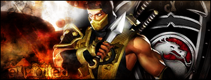
Overall, I don't like the dissaray of a panorama you have here. The subject is being used as a line to divide the image into two halves. The subject should be just that, the subject. The right side is clean but thats because you've taken the Mortal Kombat V image and haven't added anything to it. The left side is too messy. It consists of some random... brushing is it? and an over contrasted, somewhat transparent blade (which by the way is on top of the character's shoulder). I suggest, as I do to many people here, to give the render an environment to exist in rather than slapdash content to fill up the background. The typography needs work. My policy (in most cases) is to keep the text and border simple. Seeing as you've done the border simple, good job, I think that you should work on the text. Not only is it hard to read but its way too complicated. Let your content be complex, keep the typo simple. I don't really have any suggestions for fonts, sorry, I've never made anything of that ilk.
In the future, don't post your work unless you're mature enough to take the criticism that follows with acceptance that not everybody is going to like what you do. Take what people say and work from it. Fix what they say is wrong and use it as inspiration to do better. Don't throw a hissy fit if somebody finds something they dont think is utterly amazing.
-
i didnt know 1 little comment would be such a blow to him.....
lol...nicely put Jack
-
ROFL! :lol: :lol: :lol: you guys have made my day I laughed so hard at this thread im quoting u guys :P
about siggy... no comment :lol: :P
-
ROFL.. Jack Pwned you..You clearly asked for Cnc... Grow up/.
On the sig.. The right side of the bg seems out of place.. It just doesn't flows.. Text is barely visible..
 Posting Permissions
- You may not post new threads
- You may not post replies
- You may not post attachments
- You may not edit your posts
-
Forum Rules
|


 Reply With Quote