GFXVoid Graphic Design Forum

Remove Text Formatting
Loading...

» Online Users: 671

0 members and 671 guests
No Members online

» Site Navigation

 > FAQ

» Stats

Members: 35,442
Threads: 103,075
Posts: 826,688
Top Poster: cc.RadillacVIII (7,429)
Welcome to our newest member, Lekelindids
Results 1 to 6 of 6
  1. #1
    Join Date
    May 2005
    Posts
    26

    Default

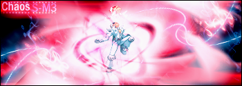
    Well its been a while since ive made sigz and while messing around with filters in photoshop i created this and i thought it looked pretty nice! Its pure filters except for the 4 wavy lines 2 in the top right corner and the 2 in the bottom left corner which i made wit a 1 px brush, outer glow and a filter to make it wavy. The text sucks but then again i was never good with text..newayz R/C!


  2. #2
    Join Date
    Jun 2005
    Location
    NSW, Australia
    Posts
    3,262

    Default

    I think you did well And the text is fine

  3. #3
    Join Date
    May 2005
    Posts
    65

    Default

    what is that render? i think its bad quality compared to the rest of the sig, maybe try a diff render it would look much better. the filters and everything are nice though

  4. #4
    Join Date
    Apr 2005
    Location
    Scotland
    Posts
    2,177

    Default

    i think its pretty cool but i can't really see the render :P

  5. #5
    Join Date
    May 2005
    Posts
    26

    Default

    the render is a SPRITE character from marvel vs. campcom..theyre always small..this is my first try at a filter/sprite render sig..thought it turned out well..i think ill search for a better render though..thx all and more r/c please!

  6. #6
    Join Date
    Jun 2005
    Posts
    158

    Default

    looks cool excpet the render is kinda ugly

Posting Permissions

  • You may not post new threads
  • You may not post replies
  • You may not post attachments
  • You may not edit your posts
  •  
Powered by vBadvanced CMPS v4.1.1