0 members and 25,655 guests
No Members online

» Site Navigation

» Stats
Members: 35,442
Threads: 103,075
Posts: 826,688
Top Poster: cc.RadillacVIII (7,429)
|
-

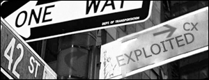
ok, alls ididwas change the street signtext, this was prettymuch just a test with the vanishing tool,
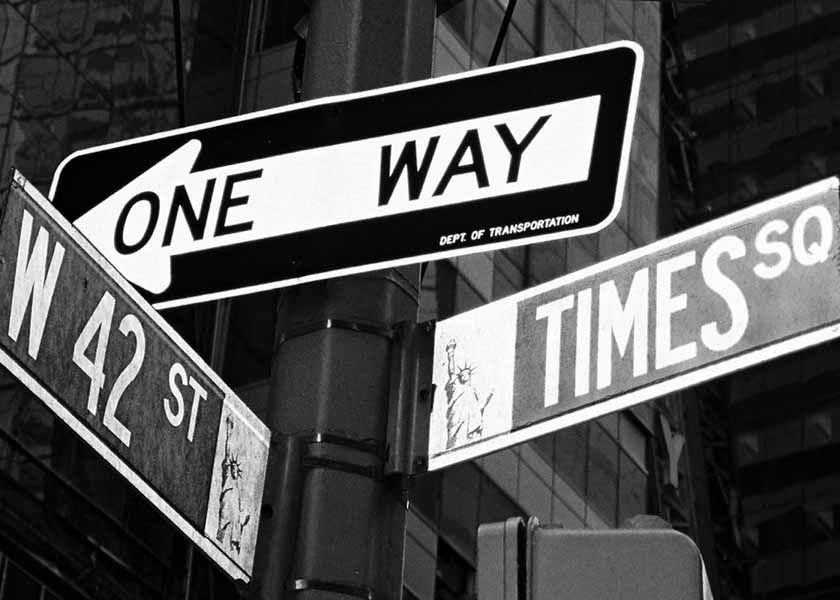
original,
well,it didnt come out good, cause it was my very first time trying out the tool  ,but neways, CnC ,but neways, CnC
-
Wow. I love it! Very nice work. Great job.
-
looks cool, good job.
-
Next time try transforming image then changing the perspective. Also notice how the street sign font is white and on the background it's green (in this case the gray). Try to match the technique used IRL as opposed to changing the style completely for a better photo manipulation.
-
it looks like you didnt change much........i dont do photomanips but the ones i have seen have major changes like coloring and such
-
looks quite good very simple
-
thanks.and yea,alls i did was change the text,just a little quick manip,type thing
-
What Zeek said.
LMAO..you angled your name the wrong way as well. Plus it jut looks pasted on there..Fix that and it would look alot better..but still like a really simple manip.
-
Like that alot, nicly maniped.
-
Originally posted by interstella hitman@Aug 5 2005, 04:09 PM
looks quite good very simple
[snapback]65477[/snapback]
This is not classified as simple, get your definitions right, everybody keeps classifying signatures as SIMPLE when they are obviously not.
Great work, keep it up! 
 Posting Permissions
- You may not post new threads
- You may not post replies
- You may not post attachments
- You may not edit your posts
-
Forum Rules
|


 Reply With Quote


