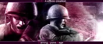
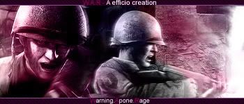
GFXVoid Graphic Design Forum

Remove Text Formatting
Loading...

» Online Users: 4,167

0 members and 4,167 guests
No Members online

» Site Navigation

 > FAQ

» Stats

Members: 35,442
Threads: 103,075
Posts: 826,688
Top Poster: cc.RadillacVIII (7,429)
Welcome to our newest member, Lekelindids
Results 1 to 3 of 3

Thread: W . A . R

  1. #1
    Join Date
    Jul 2005
    Posts
    69

    Default

    Version 1.


    Version 2.


    Whitch version you like, and should i current?


    -Custem lighting effect on face and explosion.

    -Custem color work and overall focus.

    -Maniped photo placement.

    Original


  2. #2
    Join Date
    May 2005
    Posts
    74

    Default

    Meh, i don't like this one at all, the colouring is horrible, looks like a poor attempt at multi colouring with colour balances. And it should be 'An Efficio Creation' not 'A Efficio Creation'.

  3. #3
    Join Date
    Jul 2005
    Posts
    541

    Default

    Meh, i don't like this one at all, the colouring is horrible, looks like a poor attempt at multi colouring with colour balances. And it should be 'An Efficio Creation' not 'A Efficio Creation'.
    He's right....

Posting Permissions

  • You may not post new threads
  • You may not post replies
  • You may not post attachments
  • You may not edit your posts
  •  
Powered by vBadvanced CMPS v4.1.1