0 members and 26,370 guests
No Members online

» Site Navigation

» Stats

Members: 35,442
Threads: 103,075
Posts: 826,688
Top Poster: cc.RadillacVIII (7,429)
|
-

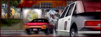
Absolutely no renders in this at all, not one at all. The billboards in this are made of sigs and logos I've made, everything made with the pen tool and soft brushing, over 1000 layers and as usual, only default brushing used. I hope you like it, cheers, Tred.

Edit: I've come up with another version based on your feedback, please let me know which one you prefer.

-
-

Haha thanks alot man, appreciate your feedback.
-

WOW! how long did it take you to make that?
-

wow thats amazing dude, much props on that sig.
-

Haha thanks guys, really appreciate your response.
Exploited, it took over 60 hours of non-stop work.
-

omg, man. Thats awsome...
10/10
-

Originally posted by Tredici@Aug 9 2005, 08:34 PM
Exploited, it took over 60 hours of non-stop work.
[snapback]67189[/snapback]
 omg H0LY SH!T ! omg H0LY SH!T !
-

Originally posted by .exploited@Aug 10 2005, 04:38 AM
 omg H0LY SH!T ! omg H0LY SH!T !
[snapback]67191[/snapback]
Lol, well the only way I feel I can be at my full potential is by working that long. Cheers, Tred.
-

Looks pretty good. I like it that you made it yourself, good for you. Great to see more people doing that around here. I like the overall feel of it, it feels sort of like grand theft auto. Is that what you were going for? Anyway, I think you need to work a bit on the trees, the trunks of the trees lack a little depth, they seem kinda flat. The shading of the whole thing is nice, I like that half wall that divides the street and the grass, the pitch seems just right. Some of the lighting however I'm not too sure about. The buildings in the background for example seem way too bright for it to be night. The brakelight on the policecar seems a little strange, but it isn't bad. That and the back section of the policecar seems too.. (for lack of a better word) bumpy. I think the ground is too bright under the red car. Even in broad daylight its darker under a car. Finally, the night sky is really distracting. I get the idea you were going for making it orange, but I think you went a little overboard with it. Make it a little darker. The starfield needs some serious help. In the city, due to all of the lights, your not going to see many stars, but your stars all seem the same size, luminosity, and distance from the viewer. Vary that up a bit. Maybe tone them down and take a couple away. The moon/sun/star thing thats hidden behind the tree seems really out of place. The other thing I noticed is that its difficult to find where your lightsource is. I like this though, its good stuff. Keep working and making your own stuff 
 Posting Permissions
- You may not post new threads
- You may not post replies
- You may not post attachments
- You may not edit your posts
-
Forum Rules
|


 Reply With Quote


 omg H0LY SH!T !
