


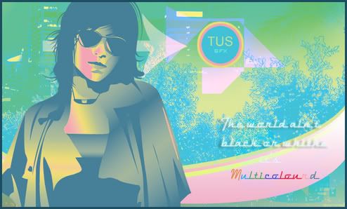
first one: didn't do the vector on the render, rest is just manip or pen tool.. I really wanted to work on colours here.. and I think it worked out ok...
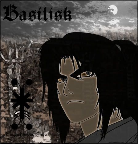
ok this is a basilisk splash (duh..) vectored the Image myself.. first try on vectoring images.. also made a miserable attempt on making a symbol with Illustrator.. rest are manips...
So tell me what cha think.. and what I need to improve.. Text kinda sucks I know.. :P
greets

 Reply With Quote