0 members and 6,524 guests
No Members online

» Site Navigation

» Stats
Members: 35,442
Threads: 103,075
Posts: 826,688
Top Poster: cc.RadillacVIII (7,429)
|
-

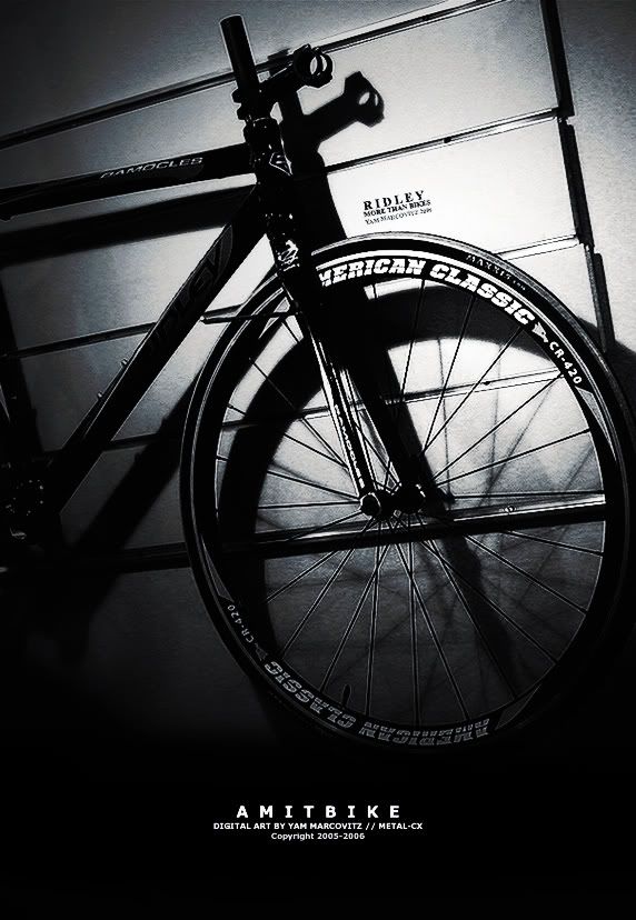
Original (Took that photo yesterday in the shop):
http://img.photobucket.com/albums/v6...X/P1010002.jpg
Poster:
Will probably add some stuff and submit to dA.
-
The Ridley - More than Bikes is a bit hard to read (I'm sure it'll be fine when the poster is produced though).
-
Has a great effect, looks really good. Looking forward to the final product, sure it will look great.
-
Yeah, i like it, especially how txt on bike is so clear... great manip, loving the black and white....
Is your name Yam?
-
lol I knew someone would ask that.
yeah, it's yam, but not like the vegetable (it might sounds like that if you're american) lol. it's an israeli name and you pernounce it like yum(or yuhm, yahm, etc). it means sea in hebrew and it's pretty common here.
now that we got that sorted lol, thanks for the comments.
-
Looks good. I like the black and white effect, and how you created great depth. Good work Yam.
-
Originally posted by MystiKal@Aug 12 2005, 11:09 PM
Looks good. I like the black and white effect, and how you created great depth. Good work Yam.
[snapback]68182[/snapback]
Lmao, i was gonna call im that now....
-
That is a brilliant poster. Great typography, great layout and positioning, great depth, catches the eye of exactly the right audience perfectly.
There is one problem I can see though, and it's bugging the absolute shit out of me. Where it says "Ridley - More than Bikes", it isn't in line with the bike rack and it looks strange. It needs to be rotated like 3-4 pixels anti-clockwise. Other than that one little problem though, it's a fantastic poster.
-
Another great piece by Metal.
Love all you work!
Good job mate.
-
hmmm. nice work. How much did get payed for it?
 Posting Permissions
- You may not post new threads
- You may not post replies
- You may not post attachments
- You may not edit your posts
-
Forum Rules
|


 Reply With Quote


