0 members and 1,264 guests
No Members online

» Site Navigation

» Stats
Members: 35,442
Threads: 103,075
Posts: 826,688
Top Poster: cc.RadillacVIII (7,429)
|
-


^with a Art filter, thought it looked 'artistic' like a pic on a wall at home or something 
-
-
your sigs are made they are very bright and vibrent they all rock to the max
-
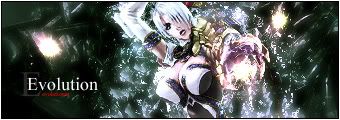
1: Looks pretty cool except the text is horrible
2: There is no text :blink: Other than that, i like it, but render needs more blending
3: Render is too blurred, looks real bad, sharpen that mutha, blend the render in, and the bg is boring, also text needs work
4: You shouldn't of filtered the render, would of looked much better, and text needs work again
5: Text needs some work, but the rest looks pretty cool, vert sigs are nice to see 
-
Originally posted by Ghost@Aug 24 2005, 08:32 AM
1: Looks pretty cool except the text is horrible
2: There is no text :blink: Other than that, i like it, but render needs more blending
3: Render is too blurred, looks real bad, sharpen that mutha, blend the render in, and the bg is boring, also text needs work
4: You shouldn't of filtered the render, would of looked much better, and text needs work again
5: Text needs some work, but the rest looks pretty cool, vert sigs are nice to see
[snapback]72174[/snapback]
There's text on the bottom left hand corner of the second sig. :unsure:
I like them all, very nice and vibrant colours, which really shout out to people who would be looking, as mentioned above, text is the only real problem, but like so many of us, text is always a problem. Nice work overall. 
-
thx guys! i get a lot of good comments here compare to other gfx sites =D!
yeah the text, i guess i just put text on for 1 reason Trademark/Copyright
so its harder to rip :P
once again, ty for the complex comments, will help me greatly i hope
 Posting Permissions
- You may not post new threads
- You may not post replies
- You may not post attachments
- You may not edit your posts
-
Forum Rules
|


 Reply With Quote