GFXVoid Graphic Design Forum

Remove Text Formatting
Loading...

» Online Users: 21,404

0 members and 21,404 guests
No Members online

» Site Navigation

 > FAQ

» Stats

Members: 35,442
Threads: 103,075
Posts: 826,688
Top Poster: cc.RadillacVIII (7,429)
Welcome to our newest member, Lekelindids
Page 1 of 2 12 LastLast
Results 1 to 10 of 17

Thread: Nas

  1. #1
    Join Date
    Aug 2005
    Posts
    117

  2. #2
    Join Date
    Aug 2005
    Location
    Florida
    Posts
    189

    Default

    dude that pwns so much, instant current, its awesome!!!!

  3. #3
    Join Date
    Aug 2005
    Posts
    117

    Default

    did it b4 u posted :P

  4. #4
    Join Date
    Jun 2005
    Posts
    665

    Default

    your work is great, only if you make the size smaLLer

  5. #5
    Join Date
    Aug 2005
    Posts
    117

    Default

    im into this size....thanks for commenting tho

  6. #6
    Join Date
    Jul 2005
    Posts
    19

    Default

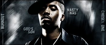
    I like it. Just the text is kinda meh.

  7. #7
    Join Date
    Aug 2005
    Posts
    27

    Default

    looks good man nice work

  8. #8
    Join Date
    Jul 2005
    Location
    Virginia
    Posts
    1,667

    Default

    Dude thats awesome, but damn you cause I was about to do a sig with Nas, he's my favorite rap artist. Excellent work

  9. #9
    Join Date
    Apr 2005
    Location
    long a
    Posts
    1,642

    Default

    LIEK OMFG, so monotone, like no color contrast (at least mix it up with a color balance layer), and loose that stupid text style. Mix it up and be creative.

  10. #10
    Join Date
    Aug 2005
    Posts
    117

    Default

    i wanted it to be 1 color thanks

    i don't use color balances in my sigs...i stopped a long time ago thanks

    its not a stupid text style....its MY text style....thanks

Posting Permissions

  • You may not post new threads
  • You may not post replies
  • You may not post attachments
  • You may not edit your posts
  •  
Powered by vBadvanced CMPS v4.1.1