0 members and 26,370 guests
No Members online

» Site Navigation

» Stats
Members: 35,442
Threads: 103,075
Posts: 826,688
Top Poster: cc.RadillacVIII (7,429)
|
-

Well like i said, the last sig was the last soft grunge i'd do for a while. I decided i'd try some minimalistic and simpler stuff.. This one went ok, but not too great imo.
-----------------
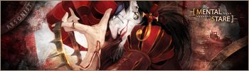
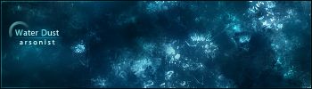
V1
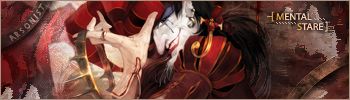
V2
Well i think i prefer the first one of these 2 as it seems to have that extra depth.
Comments on these?
-
the first one is cool, and for your mental stare one i like version 1 better. it makes you focus more on the render.
-
Yeh i see what you mean.
anymore comments?
-
Weird...i thought i posted here just a while ago....
Water Dust: Love it, colours are great, text is nice and simple, and it just flows, great job 
Mental Snare: Looks cool, v1 is better, just works well, and once again, nice text
Nice work arsonist!
-
Both look great.. They have great text...
Mental Snare : V1..The render stands out more and bg is just hot..
-
Thanks mate.
Im still curious to why people are calling it "mental snare"
-
O.o.. I just noticed.. I looked at ardeo's post.. Guess I got the mistake from there.. Haha.. BTW What fonts are those?
-
omfg dude, u got a great style going on there, thy're both swwet, current (well, u already did :P).....
-
is it just me or is the mental stare render a bit hard to pick out?
i dont like the white bit on tamborine is v1 cos it looks like the render is badly cut out
other than that, nj
-
Originally posted by Lumix@Aug 30 2005, 12:34 PM
O.o.. I just noticed.. I looked at ardeo's post.. Guess I got the mistake from there.. Haha.. BTW What fonts are those?
[snapback]74209[/snapback]
Ahh, i was ready this time for someone to ask what font i used and it was "Myriad Web".. I never downloaded it so it must have came with the pc idk. B)
 Posting Permissions
- You may not post new threads
- You may not post replies
- You may not post attachments
- You may not edit your posts
-
Forum Rules
|


 Reply With Quote

