0 members and 387 guests
No Members online

» Site Navigation

» Stats
Members: 35,442
Threads: 103,075
Posts: 826,688
Top Poster: cc.RadillacVIII (7,429)
|
-

cnc plz and current?
cnc avy plz aswell.
-
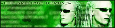
it seems alittle dull.....nothin really goin on
-
-
Too monotone....and the TWINS text needs some serious work, it's just boring to look at....
-
It needs more,its way to monotone and you may wanna try a different font.I know its the matrix font but its not always good for that sig theme
-
Originally posted by Skeptix@Sep 5 2005, 08:59 PM
It needs more,its way to monotone and you may wanna try a different font.I know its the matrix font but its not always good for that sig theme
[snapback]76389[/snapback]
X2
Just because the font went with the movie, doesn't mean it goes with the sig... The font was made to only say MATRIX not anything else, which is why it doesn't fit very well....
I also don't like the colors and stuff that much either dude, try some more tutorials, you will get better, trust me.
-
 Posting Permissions
- You may not post new threads
- You may not post replies
- You may not post attachments
- You may not edit your posts
-
Forum Rules
|


 Reply With Quote


