0 members and 5,470 guests
No Members online

» Site Navigation

» Stats
Members: 35,442
Threads: 103,075
Posts: 826,688
Top Poster: cc.RadillacVIII (7,429)
|
-

http://www.deviantart.com/view/22908165/
keep reading
Ok the other one blew, so i deleted it. I need help choosing a gift for one of my good friends, please choose from the following three.
1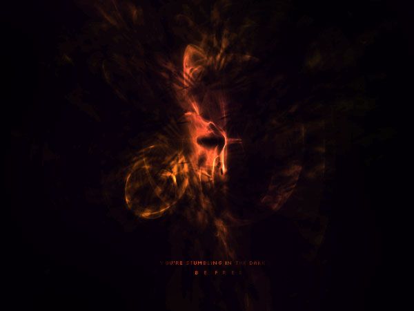
2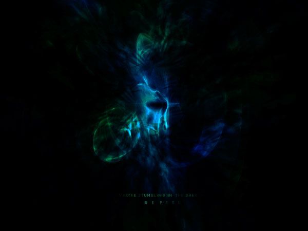
3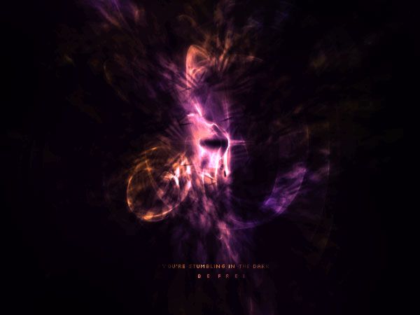
ya just tell me which one and feel free to review it. SUGGESTIONS ARE NEEDED ASWELL!
1-2 hours Apophysis
3-5 hours photoshop
I'm still getting back into it, so ya, don't hurt me
EDIT!
-
Looks great. The first one looks very nice feel to it with the orange. The 2nd looks good as well, if you tried for more of a water effect (Adding more brightness to the overall image it'd have a better look). But i'd choose the first.
Or maybe the second. Ahh gosh I don't know.
-
Verrrry nice lvoign this one good job.
-
Originally posted by ZeekUnreloaded+Sep 13 2005, 05:33 PM-->
Looks great.* The first one looks very nice feel to it with the orange.* The 2nd looks good as well, if you tried for more of a water effect (Adding more brightness to the overall image it'd have* a better look).* But i'd choose the first.
Or maybe the second.* Ahh gosh I don't know.
[snapback]78384[/snapback] [/b]
Ok thank you, and ok I see what you mean in the 2nd one. I just noticed that the quality in the first one is absolutely horrendous, so I'm going to fix that one. Thanks for the comment, I'll post a revision of the 2nd one in about 5 minutes, thanks for the review!
<!--QuoteBegin-.Tech@Sep 13 2005, 05:34 PM
Verrrry nice lvoign this one good job.
[snapback]78386[/snapback]
Thanks tech, glad you've finally learned how to spell too. <3
EDIT!
-
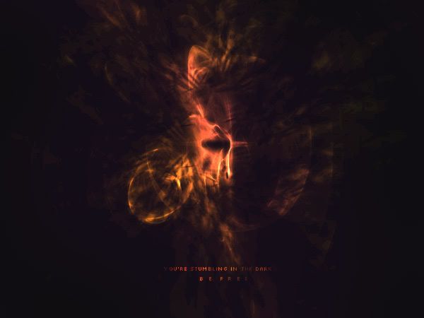
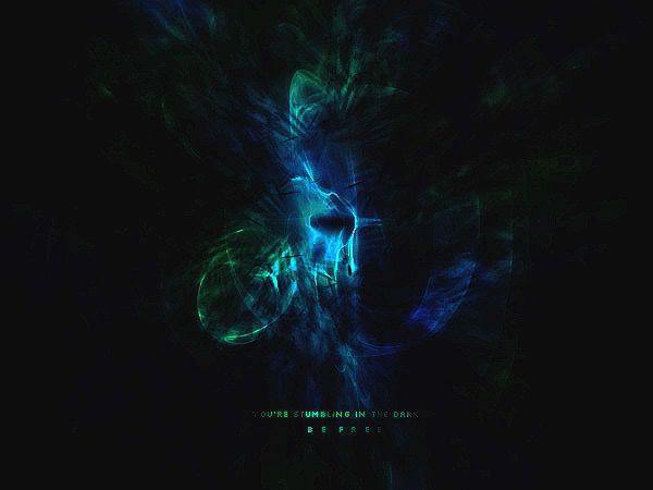
I like the last one.. Maybe sharpen it a lil?
-
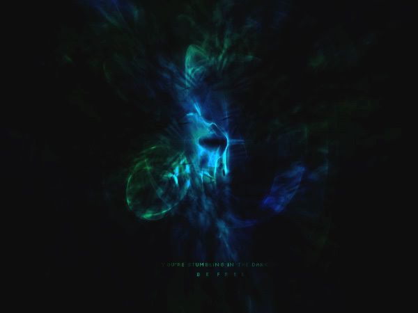
If Lumix is including the edited version of you post, with the Blue-green as the last one, I agree. 
-
I don't know about sharpening it. It would kill the soft look that compliments it.
-
here is a sharpened version, I don't have the original psd at school (where I am, so I modded the jpg). I really like everything but the text in the sharpened version.
thanks for all the comments guys, keep them coming.
 Posting Permissions
- You may not post new threads
- You may not post replies
- You may not post attachments
- You may not edit your posts
-
Forum Rules
|


 Reply With Quote
