0 members and 3,168 guests
No Members online

» Site Navigation

» Stats
Members: 35,442
Threads: 103,075
Posts: 826,688
Top Poster: cc.RadillacVIII (7,429)
|
-

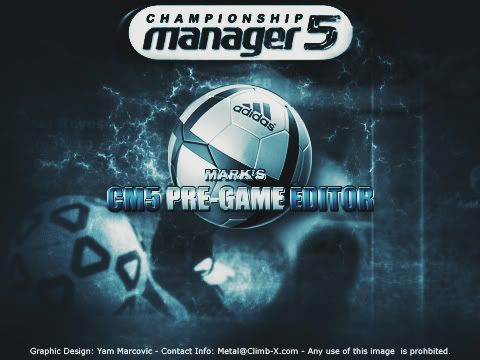
Well, I've worked with an (appearantly) really smart guy - the first who managed to make an editor for my favourite game - CM5... He's a good coder, but the program itself looked like Widows98 software...
So we're working on making it look better, soon he'll send me the interface so I can work on it, but, in the mean while, I've made a splash for the program... It shows when the program loads up.
Anyway,
Opinions appreciated.
-
"Any use of this image is prohbited."
That line, there are 2 mistakes there
1) There are two spaces after the word "image" as far as I can see.
2) It's spelled prohibited, not prohbited.
----------------------------------------------
Well on to the graphics, the championship text is too sharp and doesn't look that good, put it over the contrast layer if it is under one and/or change the AA mode.
BG is great and so is the rest of the text.
Maybe the ball could fit better in. It doesn't fit very well as it is.
-
I think the ball fits nicely..
Only thing is I don't really like the effect on the central text..
Overall GW..
-
The center text is really choppy looking...
and instead of all that threatining text on the bottom, just put copyright Climb-X..
OR, use a watermark.. if you have a watermark and u put in on your image, and you find someone else who is using that image, than u can undertake legal/court actions.
-
it's a splash. and most of it is to get my name around - sigh, just read it, carefully.
-
the text on "CM5 PREGAME EDITIOR" looks pixellated i think
rest is pretty good once you fix the typos
-
very nice overall, i agree with the general critique on the central text... looks choppy...
the ball fits in well and the entire bg is great.. maybe soften up "championship manager 5" a little bit.. its kinda sharp
-
looks awesome like the bg really caught my eye first great theme to it
-
Whats up with the center text having them white spaces in it, and the image/prohibited deal needs to be fixed.
-
i like it alot ace stuff mate
 Posting Permissions
- You may not post new threads
- You may not post replies
- You may not post attachments
- You may not edit your posts
-
Forum Rules
|


 Reply With Quote
