GFXVoid Graphic Design Forum

Remove Text Formatting
Loading...

» Online Users: 725

0 members and 725 guests
No Members online

» Site Navigation

 > FAQ

» Stats

Members: 35,442
Threads: 103,075
Posts: 826,688
Top Poster: cc.RadillacVIII (7,429)
Welcome to our newest member, Lekelindids
Results 1 to 5 of 5

Thread: Senses Fail

  1. #1
    Join Date
    Jul 2005
    Posts
    234

    Default

    whooooooooooooooooooore


    but I like it

  2. #2
    Join Date
    Apr 2005
    Location
    Lexington, South Carolina
    Posts
    1,021

    Default

    buddy in a sig

    its cool

  3. #3
    Join Date
    Jul 2005
    Location
    Virginia
    Posts
    1,667

    Default

    looks good man, nice job.

  4. #4
    Join Date
    Jun 2005
    Location
    U.K.
    Posts
    3,462

    Default

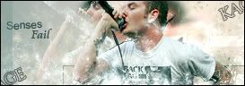
    I know the text alignment on "senses" is intended but it just doesn't look good.. Not liking the wrap around either..
    But the bar/lines/boxes seems to fit well...
    One more thing.. Repeat of the head looks weird :P
    Current.

  5. #5
    Join Date
    Jul 2005
    Posts
    234

    Default

    Thanks guys

Posting Permissions

  • You may not post new threads
  • You may not post replies
  • You may not post attachments
  • You may not edit your posts
  •  
Powered by vBadvanced CMPS v4.1.1