GFXVoid Graphic Design Forum

Remove Text Formatting
Loading...

» Online Users: 13,775

0 members and 13,775 guests
No Members online

» Site Navigation

 > FAQ

» Stats

Members: 35,442
Threads: 103,075
Posts: 826,688
Top Poster: cc.RadillacVIII (7,429)
Welcome to our newest member, Lekelindids
Results 1 to 5 of 5

Thread: dos

  1. #1
    Join Date
    Jun 2005
    Posts
    134

    Default


    I GOT SO FKING HOOKED ON LOST

  2. #2
    Join Date
    Apr 2005
    Location
    Springfield, MO
    Posts
    1,736

    Default

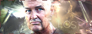
    First one is perfect.

    Second I'm not sure about because the stock is blended rather oddly, like the fact he doesn't have a face under that ear because it was erased. Besides that its pretty nice aswell.

  3. #3
    Join Date
    May 2005
    Posts
    221

    Default

    i really like the first sig althoug it's a lil' empty on the left

    but i don't like the 2nd cuz there is too much going on in it and i think you should change the border for a 1 px black

  4. #4
    Join Date
    Jun 2005
    Location
    U.K.
    Posts
    3,462

    Default

    1st one is perfect the way it is.. Add a border..
    2nd one.. Nah.. I don't think the stock fits well.. Nice try tho..

  5. #5
    Join Date
    Oct 2005
    Location
    Canada
    Posts
    176

    Default

    1st one is good 2nd one also but the stock should be something else.

Posting Permissions

  • You may not post new threads
  • You may not post replies
  • You may not post attachments
  • You may not edit your posts
  •  
Powered by vBadvanced CMPS v4.1.1