GFXVoid Graphic Design Forum

Remove Text Formatting
Loading...

» Online Users: 18,927

0 members and 18,927 guests
No Members online

» Site Navigation

 > FAQ

» Stats

Members: 35,442
Threads: 103,075
Posts: 826,688
Top Poster: cc.RadillacVIII (7,429)
Welcome to our newest member, Lekelindids
Results 1 to 5 of 5

Thread: lienomoreplease

  1. #1
    Join Date
    Apr 2005
    Location
    Behind my desk Status: nub
    Posts
    2,978

  2. #2
    Join Date
    Jul 2005
    Location
    Virginia
    Posts
    1,667

    Default

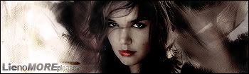
    look like something ck would make, brighten it up alittle imo on the on the right other then that it looks nice.

  3. #3
    Join Date
    May 2005
    Location
    Warwickshire, UK (Near Shakespeare's house)
    Posts
    508

    Default

    I reckon it could do with a little more saturation and some slight brightening on the right. I really like it apart from those two factors. The mismatched text fits nicely.

  4. #4
    Join Date
    Aug 2005
    Posts
    258

    Default

    i cant see anything wrong with this personally. GJ

  5. #5
    Join Date
    Apr 2005
    Location
    Scotland
    Posts
    2,177

    Default

    i don't like the big white bit, but thats probably just me...:P

Posting Permissions

  • You may not post new threads
  • You may not post replies
  • You may not post attachments
  • You may not edit your posts
  •  
Powered by vBadvanced CMPS v4.1.1