0 members and 1,303 guests
No Members online

» Site Navigation

» Stats
Members: 35,442
Threads: 103,075
Posts: 826,688
Top Poster: cc.RadillacVIII (7,429)
|
-

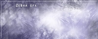
hey everyone this is a photo manip i did last night. it's for a sotw contest on another forum. let me know if yall like it and what i could do to make it better... thanks. ohh and should i current it?
heres the original [sorry for the size]:

and heres the sig:

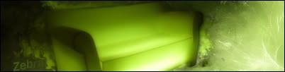
first here are some photomanips i did...(let me know if i should post the orignals or not)

--

here is on that i entered into a SOTW contest on another site (it was their first one; hence the SOTW #1). it's a little experiment into combining colors

and this is one that i did just for the fun of it last weekend
Please refrain from making more than 1 thread per day as stated in the rules. Just edit the first one you posted please. ~Respire
-
uh...lol, not liking the scan lines at all. The render is WAY to faded and Im not quite sure what you manipulated in it. Text is crap, need works. Finally, theres no border on the sig...
-
thanks for the feeback linkz. when you said that you didnt like the scan lines did you mean the white ones that i attempted to use as a border? what should should i do to make them look better, blend them more or just take them out, etc. and about the render being too faded, if you look at the orignal you can see that it is already faded a lot as it is, so its not my fault its so faded. basically in the manip i made the smoke more dirtier looking and i brushed the sky a darker color. thanks though, but i wish you would give me suggestions on how to improve it, not just tell me what you dont like... but thanks anyway 
-
I like the scan linez, they make it your own so to speak.. could work on the text a little more, maby check out some font tuts..
try adding a lil more contrast maby,, i think you could have something there if you keep working on it a little more 
-
thanks for the help empeitq, what do you reccomed i do to the text. ive looked at a few of the tuts on text, now i just have to decide which one to use. and where should i add morecontrast, to the sky or to the buildings and smoke? thanks though for the feedback
-
i would say add some contrast to the buildings and bg
and as far as the text.. try blending it into the sig (i'd suggest how, but text is my worst thing too :P )
-
Originally posted by Respire,
Please refrain from making more than 1 thread per day as stated in the rules. Just edit the first one you posted please. ~Respire
[snapback]88307[/snapback]
my bad, originally they were posted on seperate days, but someone bumped up an old one so it looked like they were posted on the same day. sorry for the confusion. but i did make sure that they were created on seperate days
-
nice new manip man but the scan lines r still 2 obvious!
 Posting Permissions
- You may not post new threads
- You may not post replies
- You may not post attachments
- You may not edit your posts
-
Forum Rules
|


 Reply With Quote
