0 members and 618 guests
No Members online

» Site Navigation

» Stats
Members: 35,442
Threads: 103,075
Posts: 826,688
Top Poster: cc.RadillacVIII (7,429)
|
-

well ive been without inspiration for a long time and recently i had a bit, but only in very small amounts so i did the best i could with it 
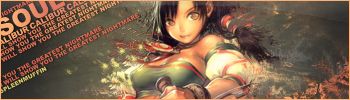
^i know this is so wh0red its not funny, but it was for sotw on another froum where the theme was smudging and basically make a smudge sig as wh0red as possible, dont ask why. this was the first time ive used smudging like that.
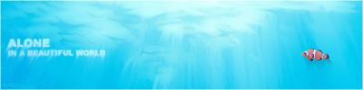
^this i just dont know, i hvae days where i like it and days where i dont, seems other people are the same, cant make up their mind if they like the fish or not etc. made with three shades of blue and a round smudge brush. the fish is a 'render'
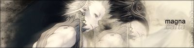
^this was actually me just messing around <_<
so CnC please, as always dont hold back. good comments just make me feel good for a bit, bad ones help me improve 
-
2nd is nice but I really like the 3rd. Current that one now...now. =p
and the whored smudge thing. People calling it smudge brushing is new, also rather stupid, but peoples been doing it for a few years now. Its not the newest trend or anything, though it would be hard to tell with all this people with jitter on their brush thinking they can smudge like a god...when its more like child. Though really that has very little to do with your post. >_< Anyways the first looks nice aswell..though the other 2 are better.
-
Originally posted by C.K@Nov 17 2005, 04:34 PM
2nd is nice but I really like the 3rd. Current that one now...now. =p
and the whored smudge thing. People calling it smudge brushing is new, also rather stupid, but peoples been doing it for a few years now. Its not the newest trend or anything, though it would be hard to tell with all this people with jitter on their brush thinking they can smudge like a god...when its more like child. Though really that has very little to do with your post. >_< Anyways the first looks nice aswell..though the other 2 are better.
[snapback]95157[/snapback]
:lol: eat some candy C.K. lol <3 anyways I like the 2nd and 3rd is very cool. The 1st to me I have no clue what to say about it but its ok imo. Nice job.
-
-
**** that i love the first for some reason, wow
-
3rd one is hot.. Text could be improved tho..
Maybe more tones to the 2nd one.. It looks kinda flat atm..
Not really feeling the 1st one mainly beacuse of too much smudging..
-
heh thats the first good comment ive had from you ^_^ i agree with the text thing but i didnt know what to do :S
 Posting Permissions
- You may not post new threads
- You may not post replies
- You may not post attachments
- You may not edit your posts
-
Forum Rules
|


 Reply With Quote


