0 members and 3,292 guests
No Members online

» Site Navigation

» Stats
Members: 35,442
Threads: 103,075
Posts: 826,688
Top Poster: cc.RadillacVIII (7,429)
|
-
-

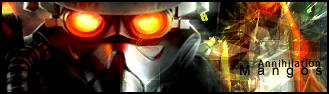
The first one looks cool, but i don't like how the render is blurred and how it's darker than everything else, second one i don't like how you've blurred the render either, third one doesn't work since nothing really goes together, the render doesn't work for me, and fourth is pretty cool but needs more blending for the render.
The text in all could be improved, but they all look pretty cool  Keep it up Keep it up
-
Thnx Sobek ur 1337!!
keep eating them 1337 bix (btw i dont know wat that means..1337 bix lol)
-
1337 bix sounds like a brand of cereal...
The first three are alright, I don't know how I would change them, but something just looks wrong.
The fourth one is better, except the render could have been blended better, and the text isn't too good, and I don't think that pixelated thing on the right fits.
Good try.
-
-
bg flows better now.. just work on your renders..
-
i don't really like any of the BG they are all too chaotic
-
renders were awesome, i espicially love the last one. The focusing of the face and those eyes.Bg was okay.
-
 Posting Permissions
- You may not post new threads
- You may not post replies
- You may not post attachments
- You may not edit your posts
-
Forum Rules
|


 Reply With Quote


